
By Catherine Austin Fitts
My “go to” website for technical analysis of precious metals, the US dollar & the US stock market is Rambus Chartology, where Rambus (that’s his handle – he’s the founding technical analyst) leads a discussion with extensive charts of what the markets are saying.
In January 2016, Rambus launched his quarterly Solari Report with a Blockbuster Chartology. You can find links to the entire series of quarterly and annual Blockbuster Chartologies at the end of this latest piece.
One of the reasons that Rambus is so good at his craft is that he focuses on “staying on the right side of the major trend.” The challenge of doing so at this time is that it is tempting to look for bottoms or to assume that the trend upwards in the US dollar or stock market may be over. However, Rambus consistently brings us back to the discipline of the Chartology. What does price tell us? As he describes so aptly, we are dealing with psychological warfare.
Sitting back once each quarter to get this perspective offers invaluable insight. So, here we go for the 1st Quarter 2022 Wrap Up Blockbuster Chartology!
Blockbuster Chartology Quarterly Report
By Rambus
~ 1st Quarter 2022 Wrap Up ~
Inflation, Commodities and Interest Rates : Paradigm Shifts in Macrotrends
US and World Stock Markets
The Many Faces Of Gold
Inflation, Commodities and Interest Rates : Paradigm Shifts in Macrotrends
There are just a few times in ones investing career, depending how early you start and if you survive long enough, that you are witness to some extraordinary changes from the MACRO scale perspective. A few examples would be the beginning of the 1929 crash, the end of the secular bull market that was made in 2000 that began in 1974, the 1987 crash which is still the biggest one day percentage drop in stock market history of 23%. Then there was the banking and housing bubble that collapsed into the 2009 crash low which launched our current secular bull market in the stock markets which is now 13 years old.
Then there are more subtle changes in the macro world that are very rare which most investors or even economist don’t have the ability to recognize until they are well established. Eventually the change of trend is so great that one has to accept the fact and recognize it for what it is. In the beginning of a macro shift few believe it is really happening because the trend has been in place for so long that it seems normal and that is how markets work.
What I would like to show you today are several rare macro events that are going to change the world and in ways we may not understand right now, but changes are coming whether we like it or not. To think one person or a group of people can wave their magic wand and make everything the way it was before are in for a rude awakening. We are just now witnessing the birth of these macro trends that are going to be with us for many years into the future.
It is always hard in the beginning because most people don’t understand the changes and lash out to those in charge thinking they can make things right, but again that is wishful thinking. After a period of time has lapsed there will be an adjustment period and a new norm will be established. For those that understand the macro shifts will do well with their investments, but for those that are unwilling to adapt to the new environment will find it much harder and blame everyone and everything for their underperformance or outright failure.
In the first paragraph of this Report I named a few periods in the stock markets that have become folklore for those that study the history of the markets. There is going to be another date we will add to that list when we look back at this timeframe from the future. The date that will live in infamy is the March 2020 pandemic crash low. That point in time is the demarcation line from one macro trend to another for inflation and interest rates.
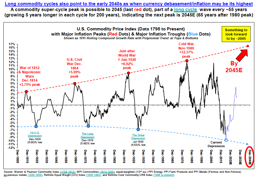
Before we look at my long term charts I would like to show you a couple of graphs which represents periods of inflation with this first graph going all the way back to 1795. The last super cycle peak of inflation ended in 1980 with a secondary peak in 2014 where my long term chart picks up the action that we’ll look at later on. The history of the graph below ended before the March 2020 low but you can see the actual low was close at hand. From cycle peak to cycle peak and growing by five years the next super cycle peak for inflation should be found around the 2045 area if history is any guide.
Below are some of the reasons why inflation is starting to take hold which most of you are already familiar with. There is another reason why inflation is going to be with us for years to come which no one is talking about right now and that is wage inflation and a simple concept to understand. After WW2 the US saw the biggest population growth in its history called the baby boomers. When they entered the workforce many jobs were created in every conceivable area in the economy.
In the 1960’s came the birth control pill that changed dramatically the brith rate for the next generation, the millennials. Now that the baby boomers are retiring in mass numbers, there are not enough workers to fill all the empty positions from the white collar to the blue collar jobs. Employees now have the leverage to ask for a higher wage which employers will have to do to keep their workforce intact. Don’t be surprised to see the immigrant population also rising in the years ahead to help fill many of the open positions that will be available.
China is in big trouble because of its one child policy back in the 1990’s. They have one of the fastest aging population on the planet and will be in much worse shape than the US. The aging demographics of the entire world for the most part is going to help fuel inflation in the future.
There is definitely a lot out there that could provide that Inflationary Shock
A) Global fiscal policy likely remains expansionary until unemployment gets to politically acceptable levels (open ended fiscal QE);
B) De-globalisation leads to higher input costs;
C) A weaker dollar (almost always associated with a rise in inflation expectations);
D) The end of the 12-year downtrend in oil prices;
E) A lot of the disinflationary impact of disruptive technology has been seen (e.g. 32% of UK retail sales are now online);
F) Higher minimum wages in the US ( Biden has a plan for US$15 per hour);
G) Money supply leads inflation by 2.5 years. The Fed (and most central banks) will now also allow inflation to overshoot (unlike in 2011) and will cap bond yields (i.e. finance deficits).
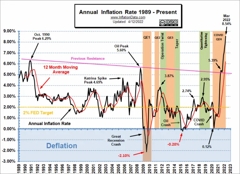
This second graph picks up where the chart above left off showing the beginning of the current round of inflation starting in 2020.
Now I would like to show you from a Chartology perspective some of the long term charts we’ve been following for many years that confirms what the two graphs above are showing.
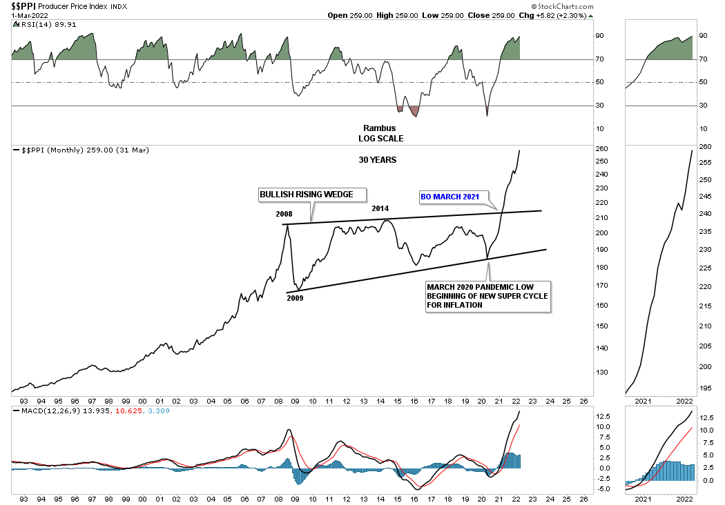
This first chart is a 30 year look at the PPI which basically shows inflation has been part of our history on an ongoing basis. Inflation took a 12 year break between 2008 and the March 2020 low building out the bullish expanding rising wedge. Just one year later in March of 2021 the PPI broke out from that very large bullish expanding rising wedge and hasn’t looked back. Note the last reversal point in that bullish expanding rising wedge was the March 2020 low.
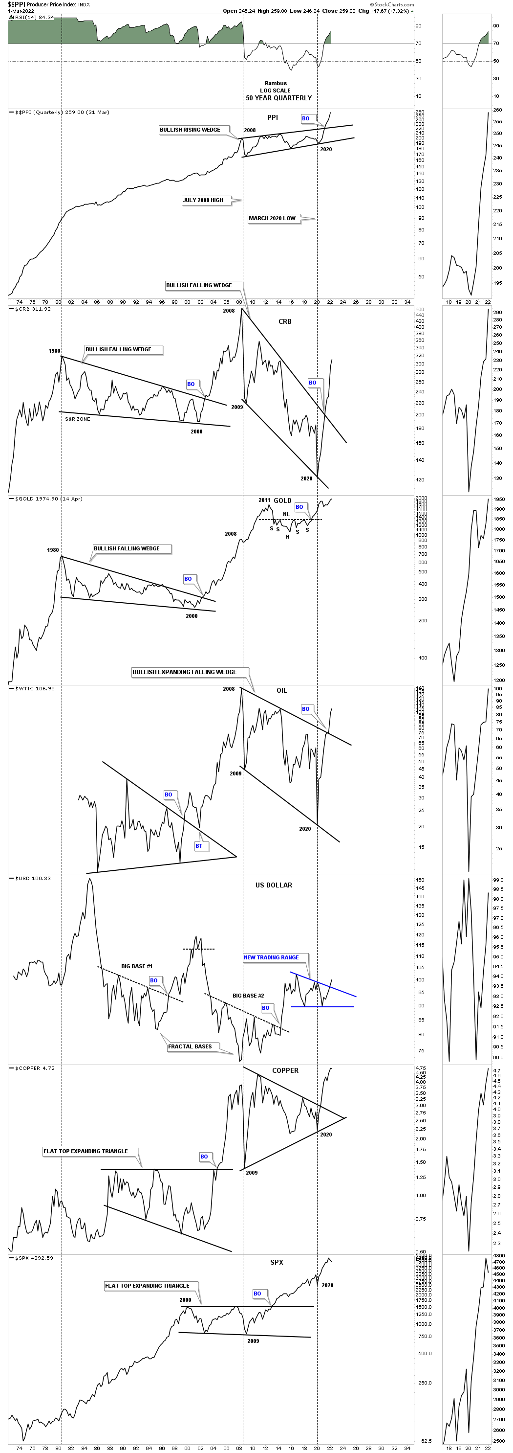
This next long term chart is a combo chart which has the PPI on top with some of the more important commodities below. The black dashed vertical lines show the bottoms in the PPI and how they correspond to the lows made on some of the commodity related charts. Even though the lows are lower lows on the CRB index and oil, the low points match up perfectly on the PPI. As you can see the 2008 low shows up on just about every index and even the 2020 low matches most of the important lows on Copper and the SPX as well at the bottom.
What is also striking about this combo chart is the long drawn out move that Gold and the CRB index had after the parabolic run into their 1980 highs. It took them 20 years to consolidate those massive moves building out a bullish falling wedge. There was a major divergence between Gold and the CRB index in 2008 where just about everything had a major correction including Gold but as you can see compared to the CRB index Gold’s correction was minuscule and hardly shows up and went on to make a new all time high in 2011 on this quarterly line chart.
When looking at the Gold chart it looks like it is in the best shape of all compared to the other commodity indexes as it is trading at a new all time high from this quarterly line chart perspective. Gold could very well be leading the rest of the commodity sectors higher.
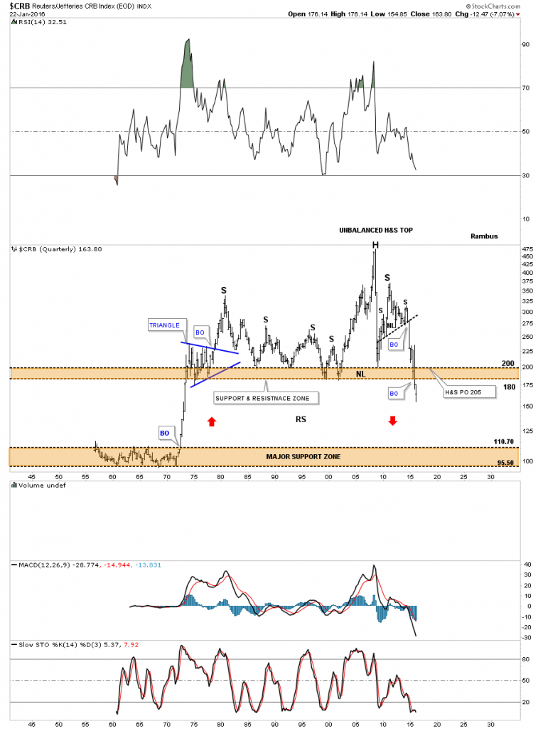
Next I would like to focus in on this long term quarterly chart for the CRB index which I originally built back in 2013 when the H&S consolidation pattern was still under construction. I had always shown the upper brown shaded support and resistance zone as major support through the years but with that H&S consolidation looming I thought there could be a chance that the CRB index could take out that very critical support zone.
What followed next was classic Chartology. When the neckline gave way from that H&S consolidation pattern the price action penetrated the brown shaded S&R zone which showed it was weakening. I’ve shown you many times in the past that when an important area of support or resistance is going to give way we usually see some type of smaller consolidation pattern just above or just below the important S&R line or zone.
This is what I wrote in January of 2016 five years ago.
This last chart for the CRB index is a 60-year quarterly chart which goes all the way back to 1955 so there is a lifetime of history to look at. Up until the early 1970’s the CRB index traded in a very narrow trading band between 110 and 95 or so. Once the price action broke above the top of the lower trading range it was a straight shot up to the beginning of the blue triangle. For over forty years the CRB index traded above the top of the brown shaded S&R zone until fairly recently. Keep in mind this is a quarterly chart which takes three months to complete a bar.
You can call the price action above the brown shaded S&R zone anything you’d like, unbalanced H&S top, double top or anything else that may come to mind. It’s the brown shaded S&R zone which is the most important thing to grasp about this chart. For over 40 years it held support and now it’s broken to the downside. This suggests it should now reverse its role to what had been support to now resistance on any backtest from below.
One last feature on this long-term quarterly chart below is shown by the red arrows. Back in the 1970’s when the CRB index broke out above the lower brown shaded S&R zone it went vertical. I’ve been showing this chart for sometime now which suggests we may see some reverse symmetry back down over the same area as the vertical rally up in the 1970’s. When I first posted this chart the price action was still trading above the brown shaded S&R zone. I’m still amazed when I look at this chart and see the price action trading below the brown shaded S&R zone which is at its lowest point since the 1970’s. How it plays out is going to be interesting to say the least. Back to the future comes to mind.
January 2016.
Today April 17th, 2022:
Below is the exact same chart as the one above and shows what happened. As you can see the initial move below the upper brown shaded S&R zone on the chart above was the very beginning of the blue bearish rising wedge which was the small consolidation pattern that I suggested could happen before the CRB index would move lower. The brown shaded S&R zone did in fact reverse its role from what had been support for 40 years then turned into resistance during the formation of the blue bearish rising wedge.
The other major point I made in the 2016 post above was that we could see reverse symmetry to the downside over the same area that was made during that vertical rally in the 1970’s as shown by the red arrows. There is nothing magical about this chart if you understand how Chartology works.
So far our discussion has been about major macro changes that are taking place in inflation, commodities and interest rates. Note where the CRB finally put in its secular bear market low which was down into the lower brown shaded S&R zone in March of 2020 which was the price objective for the blue bearish rising wedge. I have to admit that I didn’t expect to see the initial thrust to the new commodity bull market go up as vertical as it has. I thought we could see some initial resistance back at the upper brown shaded S&R zone but that wasn’t the case.

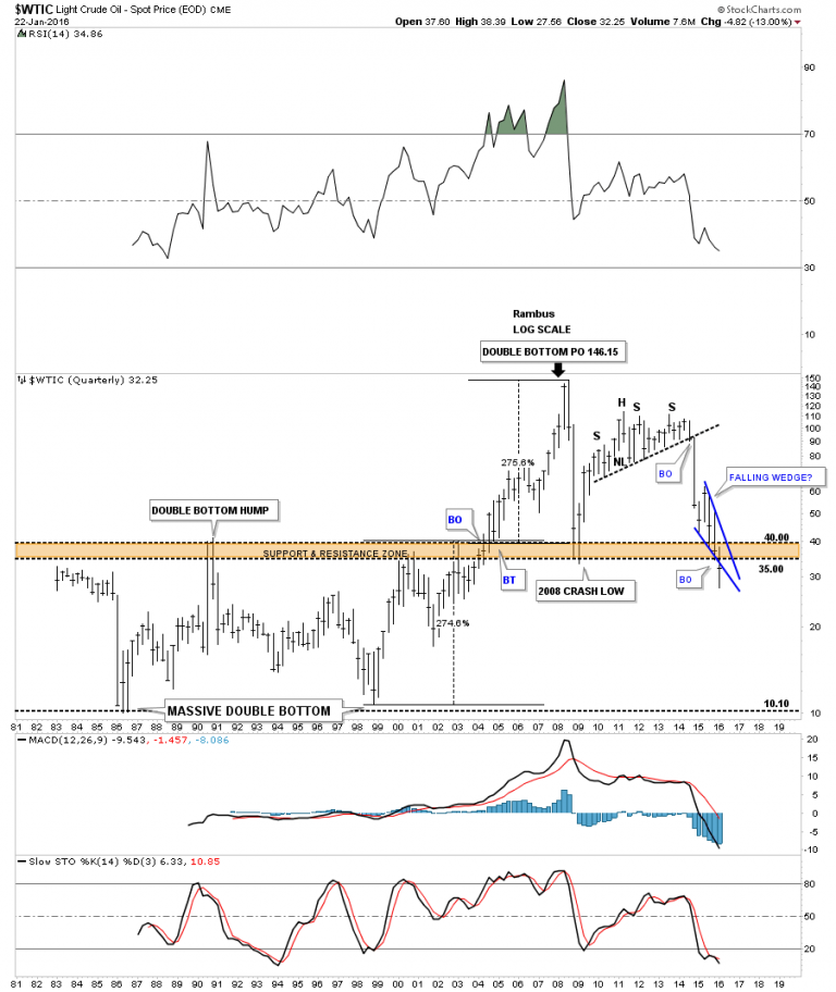
Back in 2013 or so the CRB index wasn’t the only long term quarterly chart I built. I also built one for WTIC oil, which was exhibiting many of the same characteristics of the CRB index which is understandable.
This is what I wrote on January 22, 2016 for WTIC.
Below is a very long-term 35 year chart for oil which shows its huge trading range that lasted from the early 1980’s to the early 2000’s when it finally broke above that massive resistance zone between 35 and 40. Once it broke above that brown shaded S&R zone there was nothing to stop the price action from skyrocketing up to 147 where it finally ran out of gas.
What is interesting about this long-term chart for oil is the trading range between 10 and 40. What that massive trading range measured out to was 146.15 on a percentage basis which was around 275%. You can see how our blue falling wedge has cracked below the upper brown shaded support and resistance zone. The pieces of the puzzle are all there we just have to see the price action do its thing now.
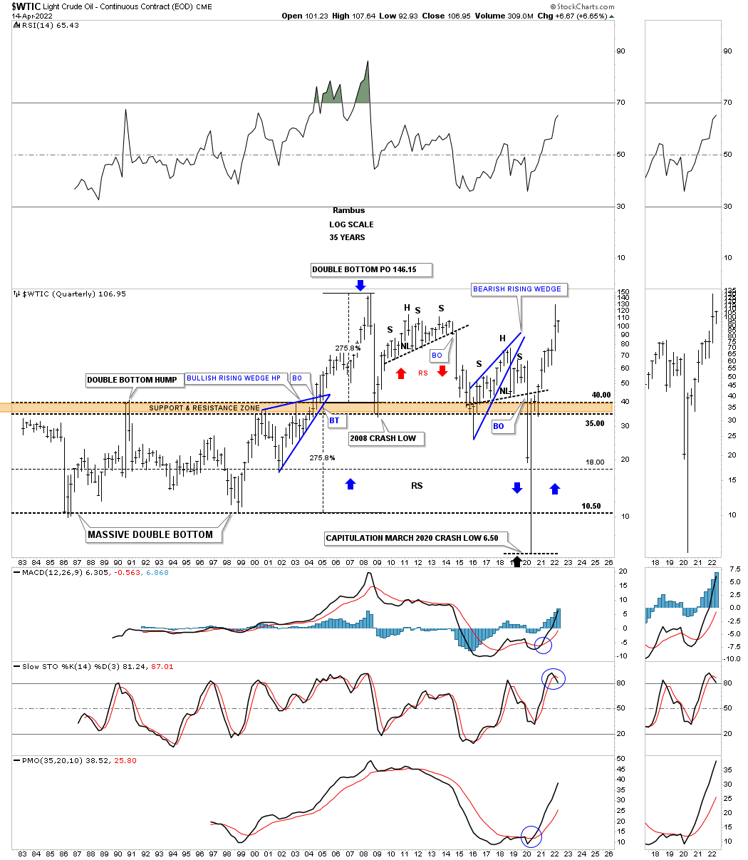
Today April 14th, 2022:
In the case of the WTIC it built out a classic H&S consolidation on top of its brown shaded S&R zone before it gave way to the downside. The classic H&S top started out with the blue bearish rising wedge which is similar to the blue bearish rising wedge the CRB index that formed below its brown shaded S&R zone. The left shoulder and head formed inside of the blue rising wedge with the right shoulder high forming on the backtest to the bottom rail of the bearish rising wedge.
As you can see the WTIC reversed symmetry to the downside making a new all time low in March of 2020 before reversing symmetry back to the upside. The WTIC did show some minor hesitation when it reached the S&R zone from below but it didn’t last very long.
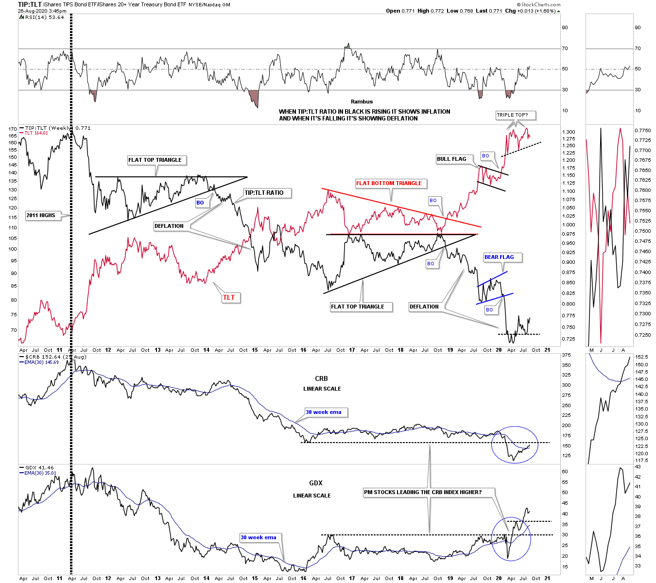
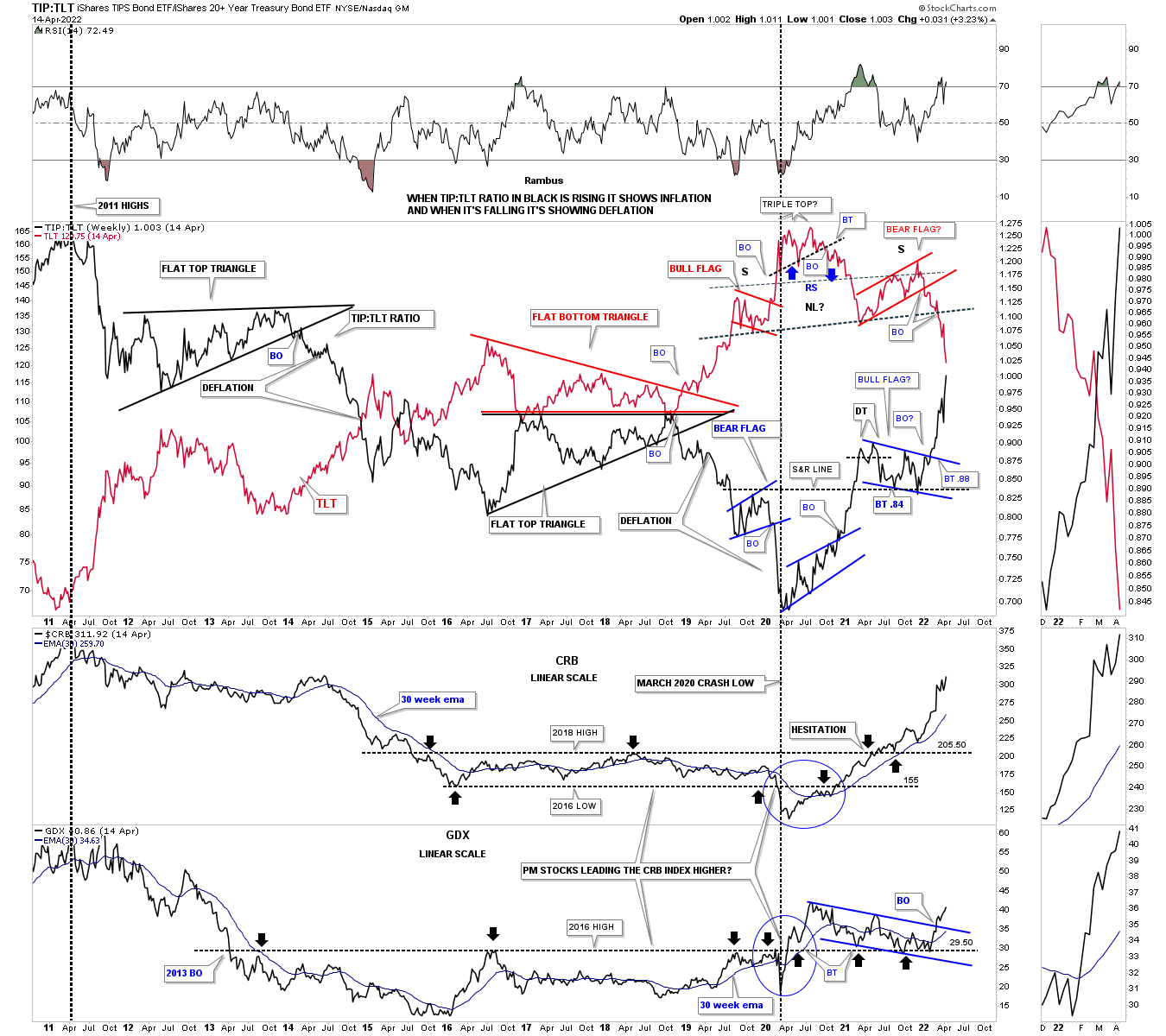
Next is the ratio combo chart that I show you fairly often which I use to gauge the deflation / inflation debate. I use the TIP:TLT ratio in black overlaid on top of the TLT in red to look for signs of which one is in charge. When the TIP:TLT ratio in black is falling that shows signs of deflation and when it is rising inflation has the upper hand. Note the nearly perfect inverse correlation the ratio in black has to the TLT. If you know what the TLT is going to do you can expect to see the ratio do the opposite. Note the possible triple top I labeled back on August 26th, 2020.
Below is what I wrote on August 26, 2020 five months after the March 2020 crash low.
This next chart is another look at the possible inflation – deflation debate. On the top chart I’ve overlaid the TLT on top of black TIP:TLT ratio that shows when the ratio is falling there is deflation which has been the case since the 2011 high. Almost 9 years to the month the ratio in black is trying to put in a small reversal pattern while the TLT in red may be forming a triple top. I also added the CRB and the GDX to the bottom of the chart. As you can see the CRB has been following the black ratio pretty closely over the last 9 years or so as it too is attempting to put in its own bottom and is now trading above its 30 week ema. As you can see the CRB has a test coming up very shortly as the previous low made back in 2016 is coming into focus. The GDX is about 1 year ahead of the CRB and is leading the new commodity bull market higher over the coming years.
Today April 17th, 2022:
This updated ratio combo chart shows what took place since the post on August 26th of 2020. That little triple top on the red TLT we looked at in August of 2020 ended up being the head of a fairly large H&S top. Note how the TLT in red and the ratio in black are now about to cross each other giving more strength to the ratio and commodities in general.
This chart also shows the CRB index and the GDX at the bottom and how they have reacted to the strength in the black ratio and weakness in the red TLT since the head portion of the H&S top. Note how beautifully the 2016 S&R line has worked since the initial breakdown back in 2013 which held resistance until the price action finally took it out during the March 2020 rally. It then reversed its role back to support on several touches from above. The CRB index also produced its own S&R line which was finally breached to the upside in 2020 with a nice clean breakout and backtest before embarking on its current leg higher. It is hard to see on this chart but the high in 2011 was the beginning of the deflationary weakness going into the March 2020 pandemic crash low which ended that phase of deflation.
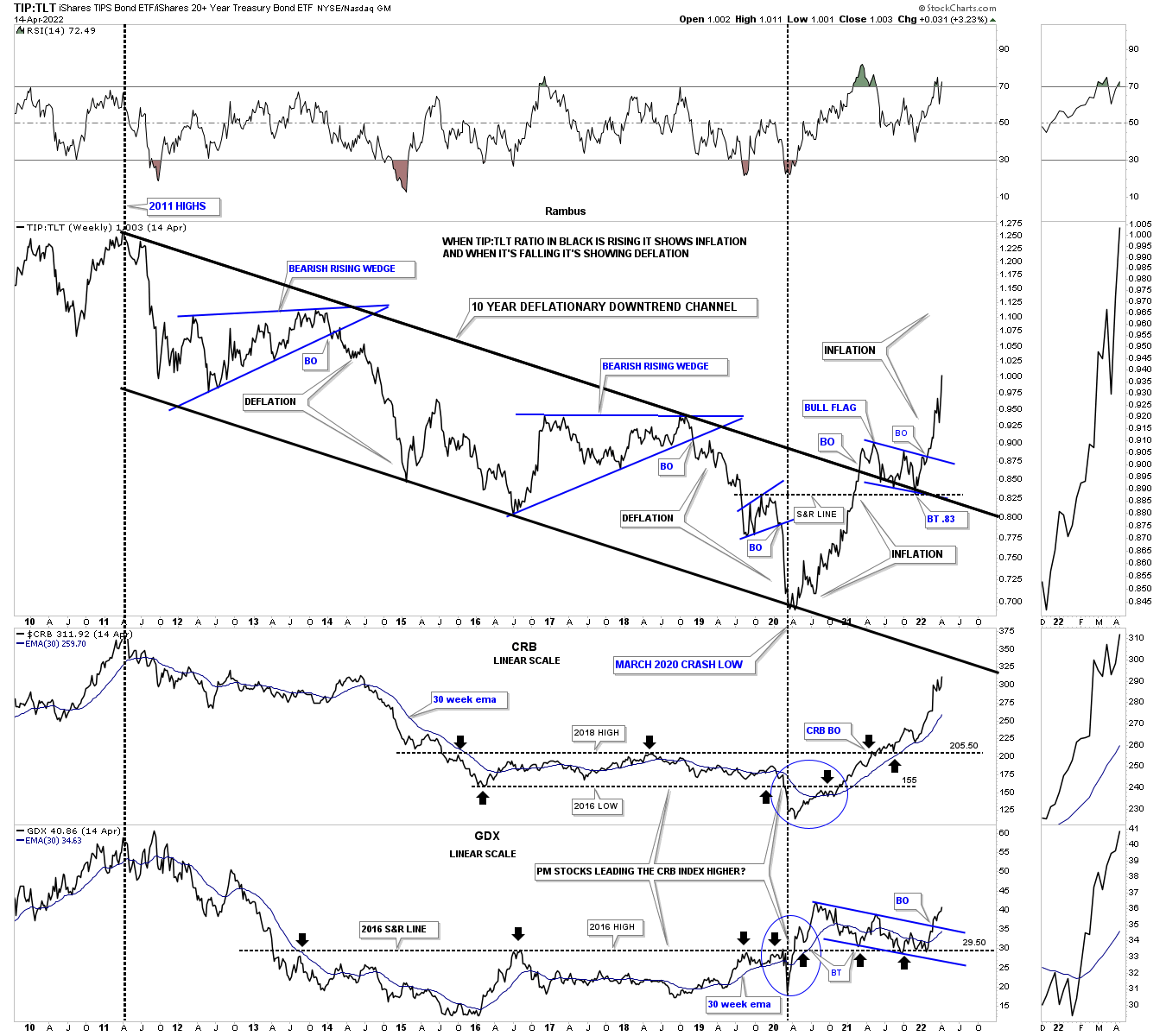
Below is the exact same chart as the one above but I removed the TLT in red so you can see the TIP:TLT ratio much more clearly. The ratio has formed a perfect parallel downtrend channel starting at the 2011 high and ending at the March 2020 low. You can see the two big blue bearish rising wedge consolidation patterns that formed inside of the downtrend channel which showed bouts of deflation.
Note the classic breakout and backtest to the top rail of the 2011 downtrend channel where the ratio formed the small bull flag on top of the upper rail of the downtrend which again is classic Chartology. The last point I would like to make is that the ratio on top and the GDX on the bottom both bottomed in March of 2020 while the CRB index bottomed out one month later in April.
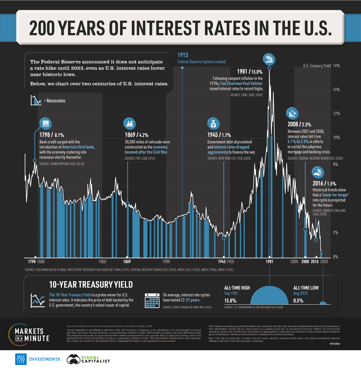
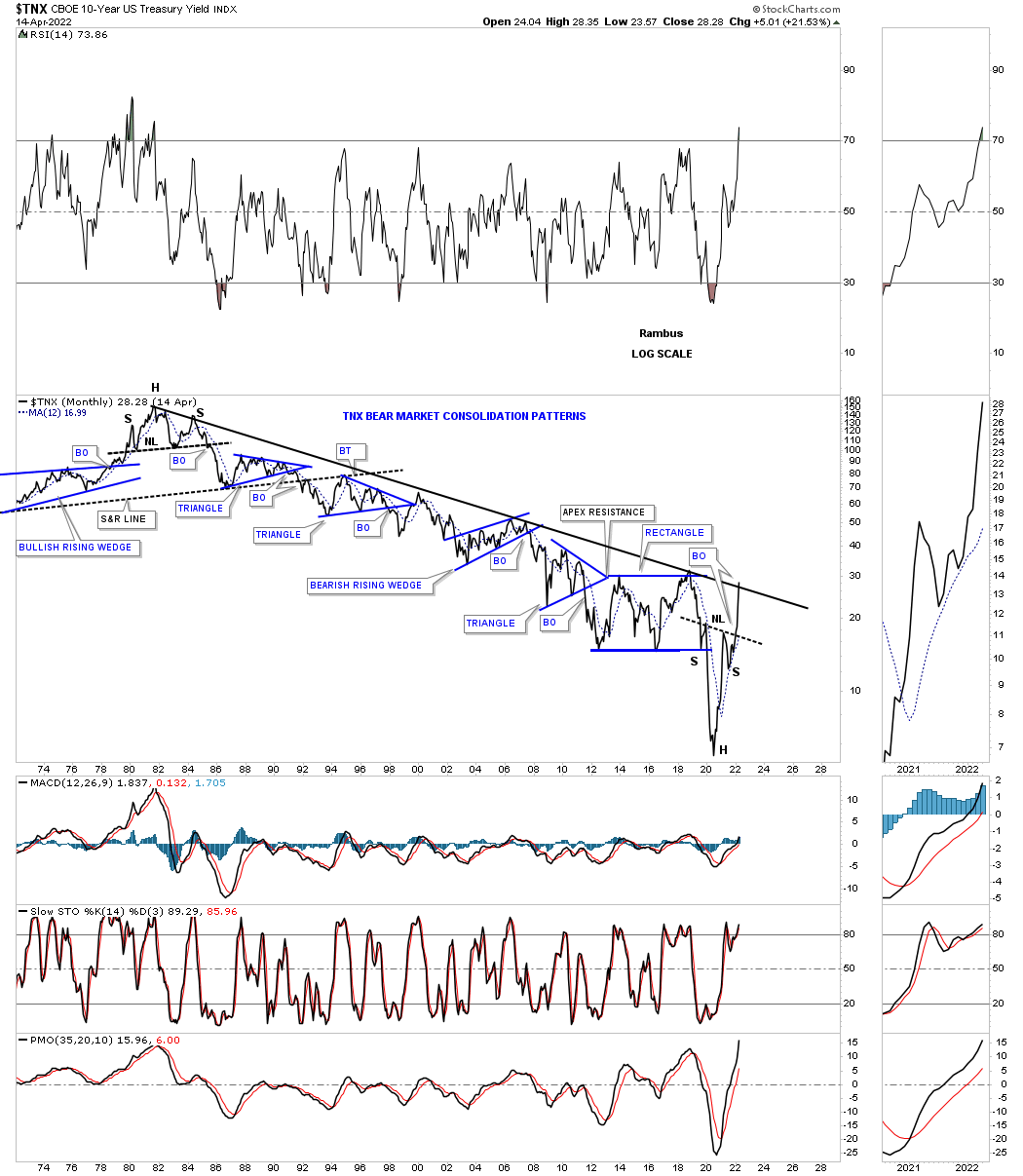
The other important part of the major changes taking place that are going to affect the US and the rest of the world and is still in their infancy is interest rates. Any student of stock market history knows that interest rates can be trend bound for many years before a reversal takes place. Below is a graph I found that goes back 200 years and shows once a major trend develops, either up or down it can last many years.
Below is a long term monthly combo chart I’ve shown you through the years which shows the 30 year and ten year bond yields trapped inside of the major downtrend channel since their all time high made in October of 1981. First, notice the H&S top that formed at the end of the last cycle in interest rates in 1981.That downtrend lasted 39 years until March of 2020. The end of a major cycle often ends in a capitulation move, blue arrows, with a vertical move, in this case, to the bottom.
We’ve been following that H&S bottom on another weekly chart for the TNX well before the breakout of its neckline which ensures the 39 year downtrend in interest rates has come to a climatic end even though the top rail hasn’t been broken yet.
It took 39 years to go from 15% in 1981 to 1/2% in March of 2020. What an incredible macro event.

Below is the weekly line chart for the TNX I’ve shown you from time to time which shows a pretty symmetrical H&S bottom, see chart above, with the neckline symmetry line holding support for the right shoulder.
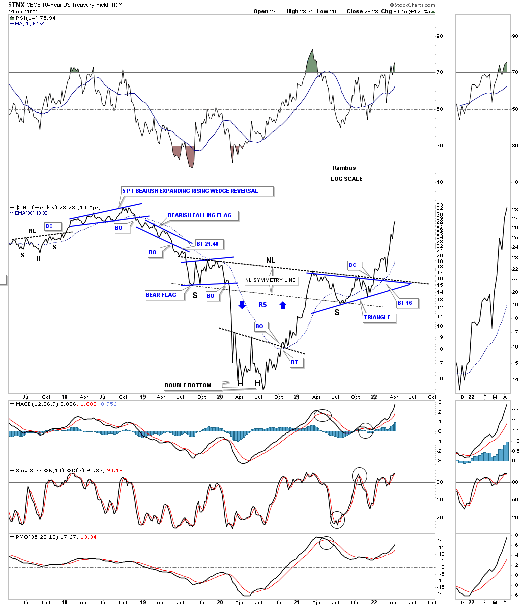
This last chart for the TNX shows all the chart patterns that formed that 39 year decline in interest rates. I hate to keep saying but this chart shows some beautiful Chartology with one consolidation pattern forming below the previous one making lower lows and lower highs all the way down.
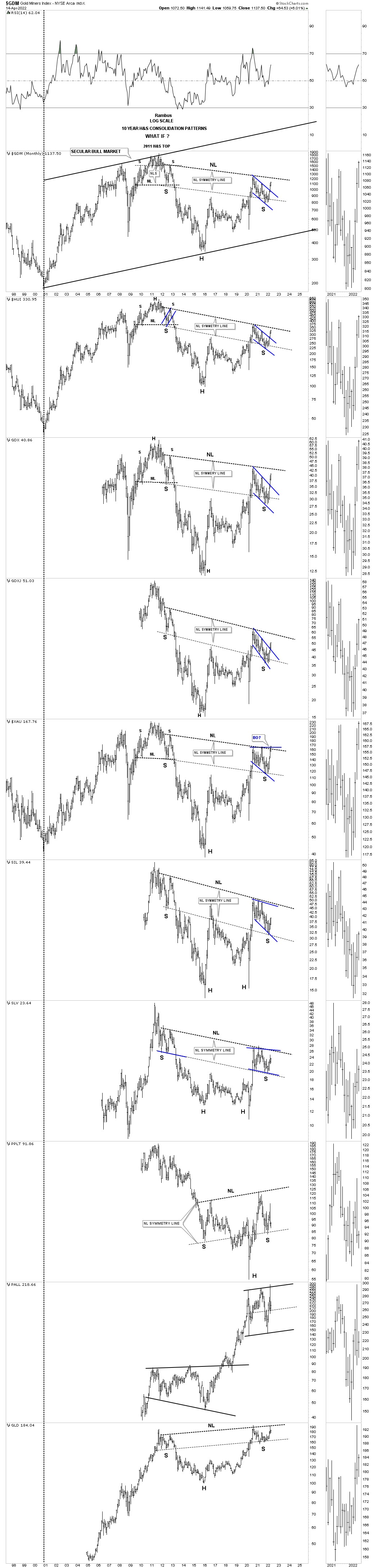
I want to leave you with this long term combo chart for the PM complex we’ve been following since the right shoulder low was made a couple of months ago in February. If you don’t believe in the power of long term charts then these charts will mean nothing to you. On the other hand if you think there is something to them then you will be able to take advantage of the MACRO changes that are already taking place. We have only one lifetime to make our fortune and now it looks as good a time as any. All the best…Rambus
US and World Stock Markets
Since this is part of the Quarterly Report our main focus will be on the longer term monthly charts which puts the big picture in perspective. What happens in the markets tomorrow or next week is for the shorter term investors to figure out. Until something changes, the long term look still remains bullish.
So far, in regards to the US stock markets I don’t see any red warning flags yet just some chopping action for the most part. There has been some strong rotation from some of the stronger sectors that led the markets out of the March 2020 crash low to some of the lagging sectors. This is usually a healthy development in the long term.
I realize that many investors are bearish on the stock markets and that is understandable since our current secular bull market began in 2009. How can the stock markets keep going up? It is called the wall of worry. Bull markets are punctuated with selloffs from time to time that is needed to work off overbought conditions and to keep investors wondering if this time the bear market is really going to start.
I’m not going to go into great detail as we’ve been following these long term charts for many years. We’ll start with the US stock markets and then look at some of the world stock markets as they all tend to move together to a certain degree.
Let’s start with the SPX as it is the most important stock market in the world and shows the secular bull market that began at the 2009 crash low. This shorter term monthly chart shows 2018 black expanding triangle with a backtest taking place to the top rail at 4100 with the long term buy signal still in place using the 21 month sma.
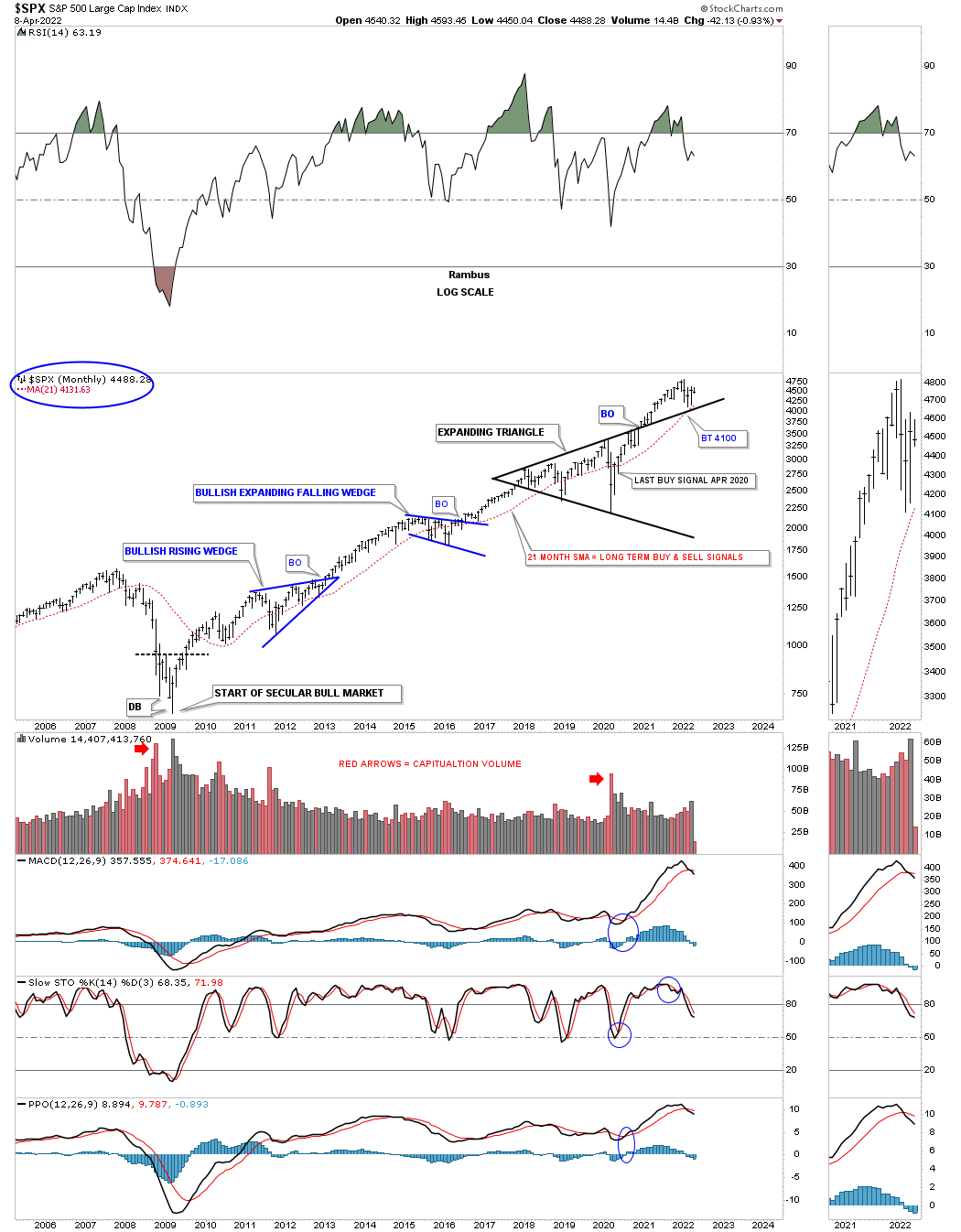
This longer term monthly chart shows the 13 year flat top expanding triangle consolidation pattern which was needed to consolidate the previous secular bull market which ran from 2974 to 2000. So far we are seeing a backtest to the top rail of the current expanding triangle around the 4100 area.
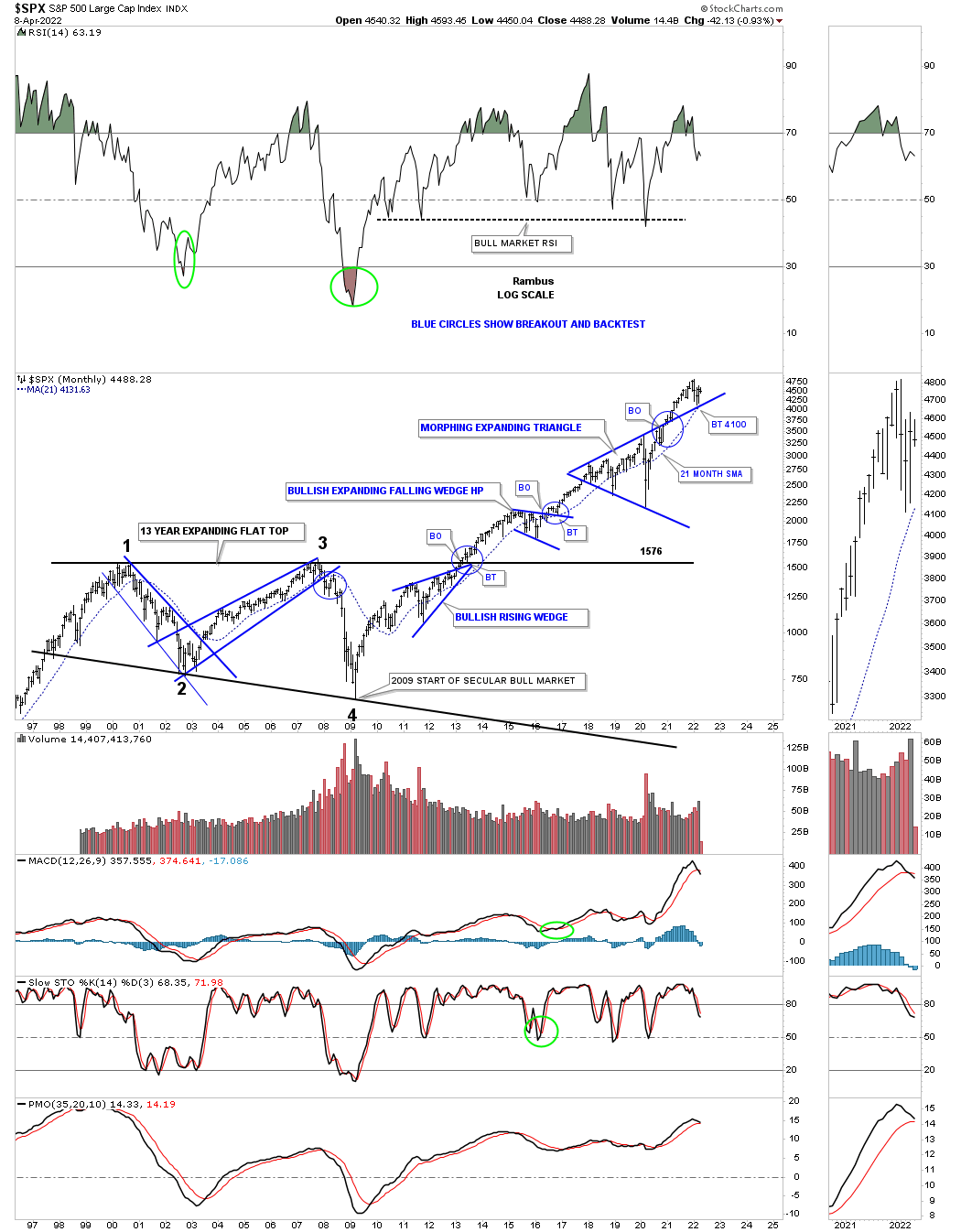
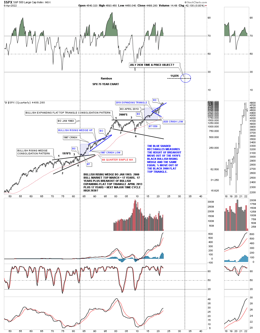
This next chart is a long term quarterly chart for the SPX which shows the secular bull market that took place at the 4th reversal point in 1982 which ran hard into the 2000 all time high at reversal point #1 in the 13 year flat top expanding triangle. That 13 year flat top expanding triangle consolidation pattern was needed to correct the pervious secular bull market. Our current secular bull market began at the 4th reversal point at the 2009 crash low at reversal point # four.
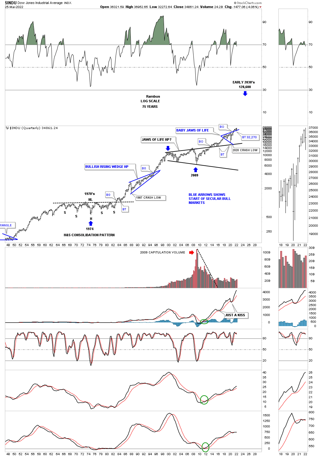
This long term 75 year quarterly chart also shows the similarities between the 1987 crash low to the recent 2020 crash low as shown by the light blue shaded areas. Compare the 1987 crash low to the 2020 crash low which gives you an idea of where our current secular bull market is compared to the 1987 crash low and the rally that followed. The SPX rallied for another 13 years before finally topping out in 2000. The SPX has only rallied about two years since the 2020 crash low so if history is any guide, as it has been since the 2009 low, then this secular bull market still has a long ways to go yet before we see any type of significant top, correction yes but no significant bear market.
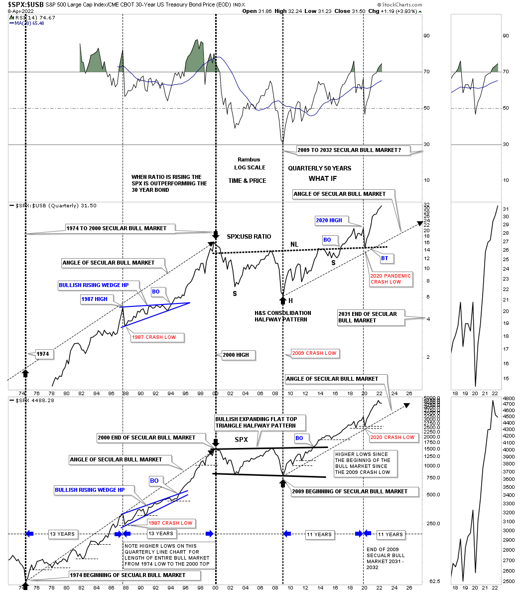
This next chart is a long term quarterly ratio combo ratio chart which compares the $SPX:$USB ratio on top to the SPX on the bottom. As you can see the ratio chart on top is confirming the secular bull markets, the 1974 to 2000 secular bull market and our current secular bull market that began at the 2009 crash low. Note the massive H&S consolidation pattern that formed on the ratio chart which you can compare to the 2013 flat top expanding triangle on the SPX. Since the 2020 crash low both have been making new all time highs which is what you would expect if the secular bull market is alive and well. There is a lot of other important information on this ratio combo chart if you take a few minutes to study the information in more detail.
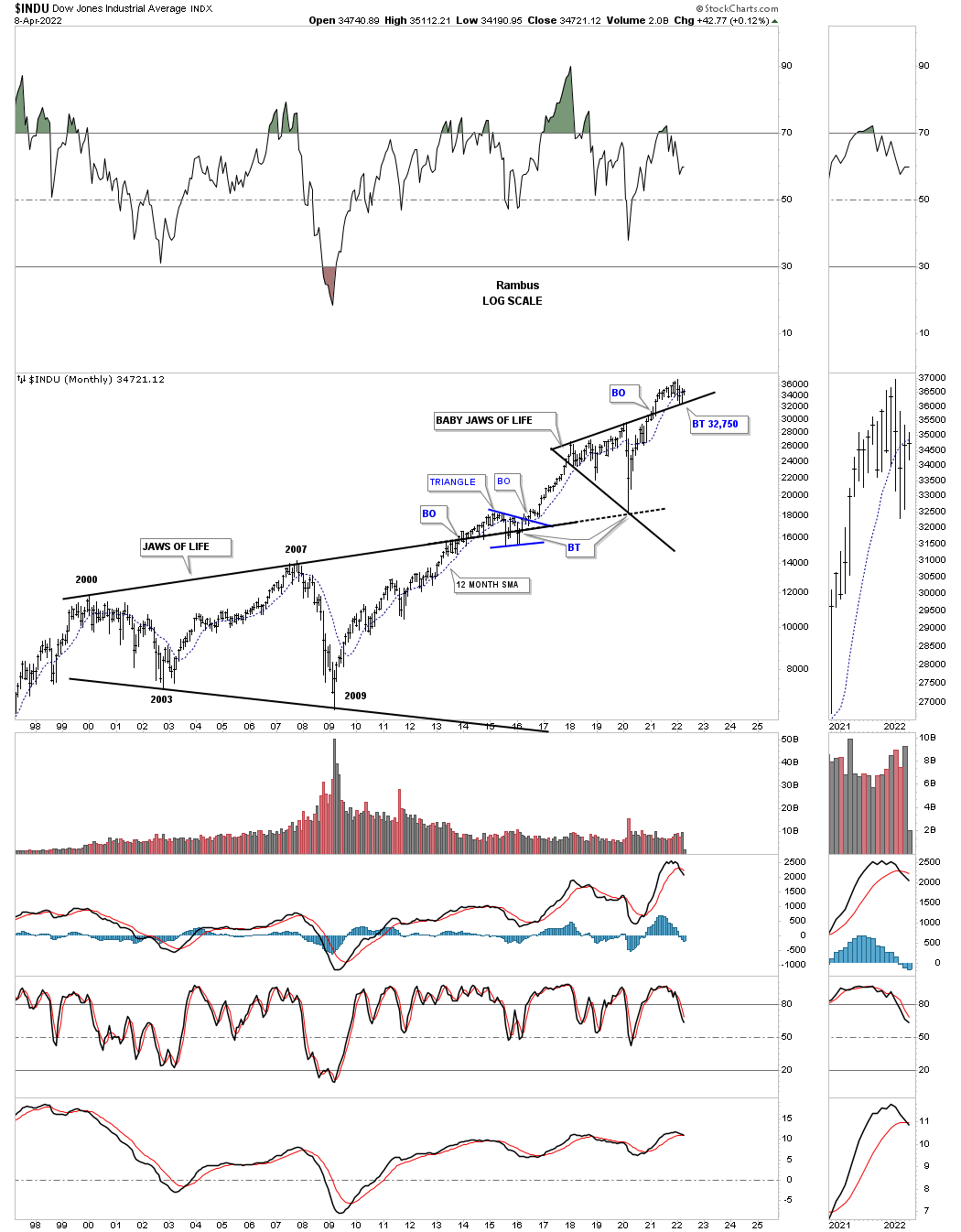
After the INDU’s secular bull market concluded in 2000 it went on to form a 13 year bullish expanding triangle which I called the JAWS OF LIFE, because so many analysts were calling it the, JAWS OF DEATH. The breaking out and backtesting process on the SPX chart above was very quick and shallow, but the INDU took its sweet ole time. The price action finally formed the blue triangle right in the center of the top rail which finally led to the next impulse move higher which ended at the first reversal point in the, BABY JAWS OF LIFE.
Note how the 2020 crash low found support on the top rail extension line of the 13 year Jaws of Life. The two year rally that followed broke the top rail of the Baby Jaws of Life with the backtest to the top rail coming in at the 32,750 low in February of this year.
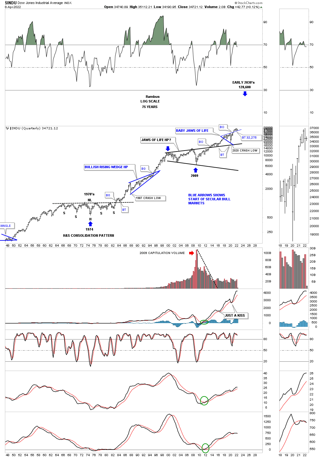
Next is the 75 year quarterly chart for the INDU which shows its 1974 to 2000 secular bull market and our current secular bull market that began in 2009. This chart shows the beautiful massive H&S consolidation pattern that consolidated the previous secular bull market that ended at the beginning of the massive H&S consolidation pattern. Here again you can see the 1987 crash low compared to the 2020 crash low. At the beginning of 2000 started the 13 year expanding triangle consolidation pattern I called the JAWS OF LIFE because I believed we are in a secular bull market. Others with a bearish view back then called it the JAWS OF DEATH, which was going to lead to the end of the world as we knew it.
This monthly chart for the Transportation Average shows the price action backtesting the top rail of the massive 2013 flat bottom expanding triangle with the bullish expanding falling wedge forming just below the top rail which strongly suggested the top rail of the black flat bottom expanding triangle was going to give way. Looking at this 20 year chart you can see the Transportation Average has produced some very nice consolidation patterns starting with the very symmetrical H&S consolidation pattern where the head formed at the 2009 crash low.
This 100 year history chart for the Transportation Average puts the current 2013 flat bottom expanding triangle in perspective. Actually the 2013 flat bottom expanding triangle looks just about right compared to the other smaller consolidation patterns that formed over the last 100 years. It is also forming on top of the multi year H&S consolidation pattern neckline.
There is a lot of classic Chartology on this 30 year monthly chart for the NDX 100 starting with the parabolic rise into the 2000 secular bull market high. Since the bear market out of the 2020 high was so strong it only took ten years to consolidate its previous secular bull market forming the ten year triangle consolidation pattern with the classic H&S bottom. Whenever you see a triangle, wedge or flag a classic H&S bottom is created when the left shoulder and head form inside of the consolidation pattern with the right shoulder low forming on the backtest to the top rail. The brown shaded areas show just how symmetrical that H&S bottom was which formed at the end of the ten triangle consolidation pattern as the last reversal point.
Another important area on this chart was the blue triangle consolidation pattern that formed just below the 2000 all time high in 2016. When that triangle gave way to the upside that strongly suggested that the secular bull market was alive and well. Now the price action is backtesting the top rail of its 2018 bullish expanding rising wedge around the 13,000 area. Until that area gives way the bulls are still in charge.
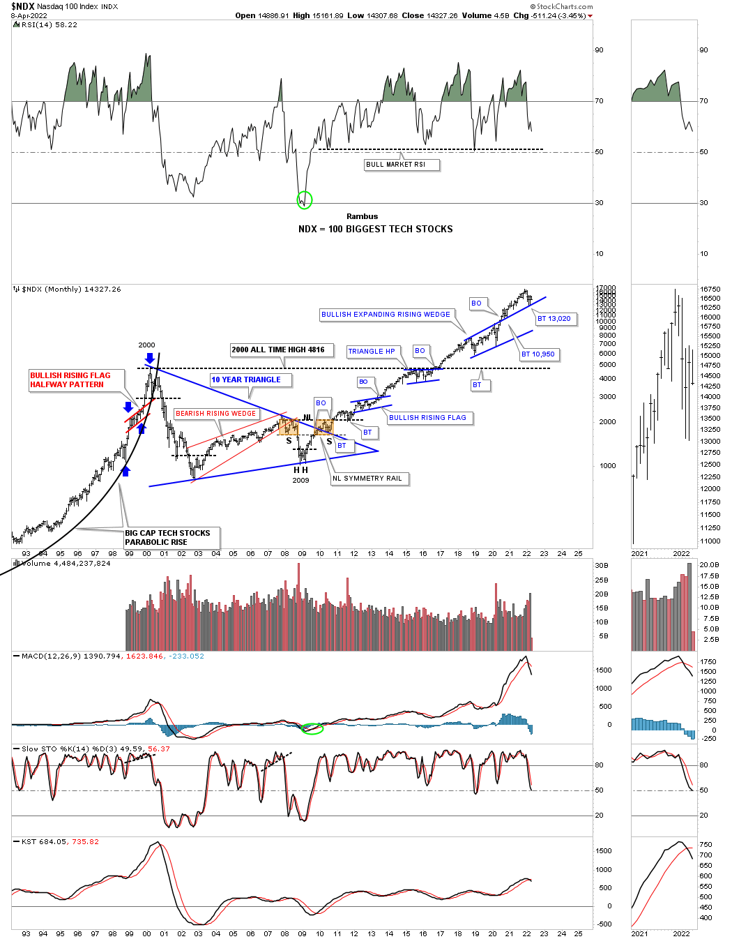
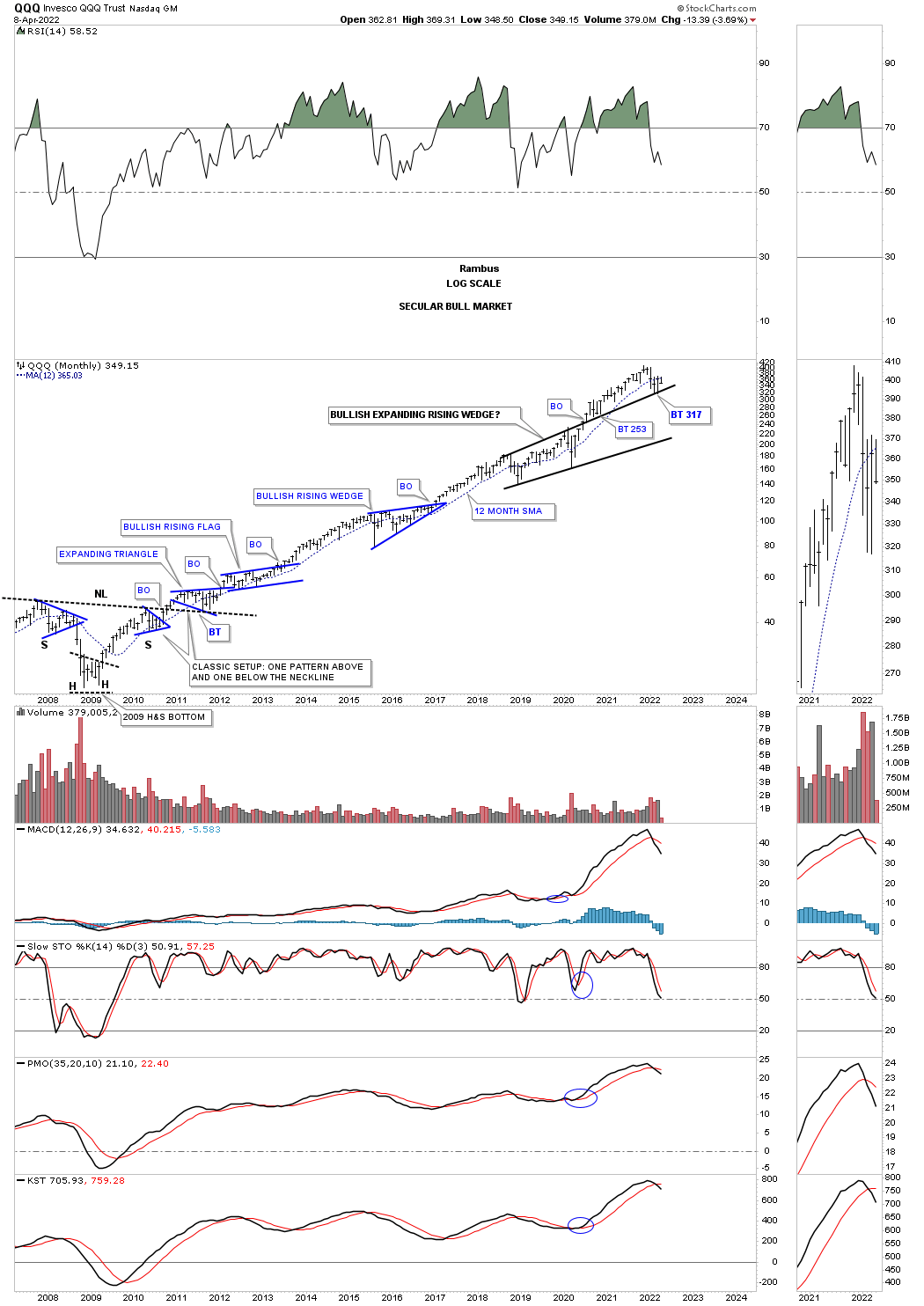
The QQQ 2009 secular bull market chart.
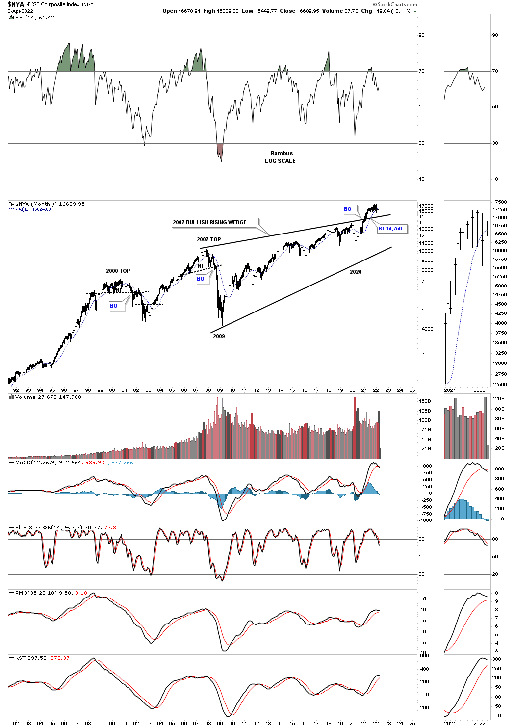
This long term monthly chart for the NYA is a bit different than the SPX and INDU long term charts we looked at earlier. Here you can see the NYA has just recently broken out of a massive 2007 bullish rising wedge.
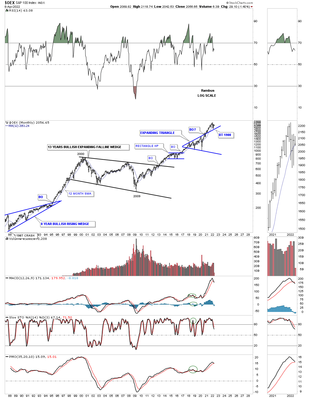
The OEX 100 with its 13 year bullish expanding falling wedge and the seclar bull market that has followed the 2009 crash low.
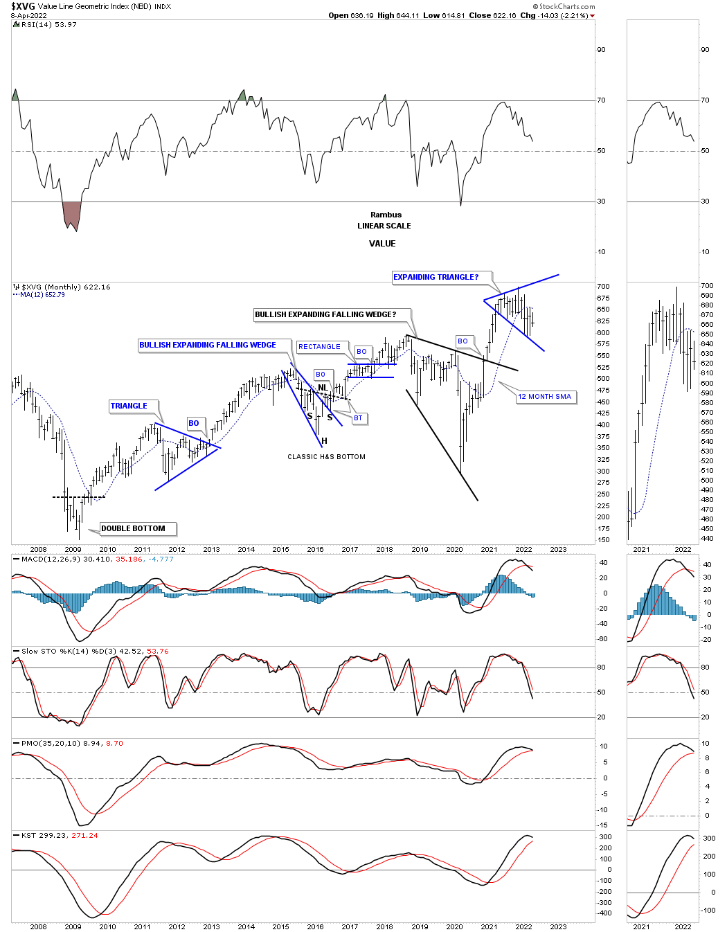
The secular bull market for the XVG, Value Line index, shows it has been trading at the lower end of its expanding triangle.
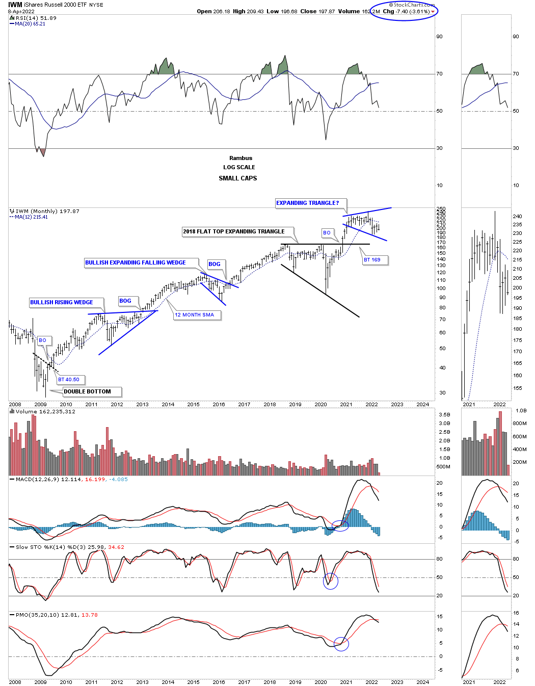
The IWM small cap secular bull market.
Now for some world stock markets.
I’ve been saying since the 2020 crash low that it wouldn’t be just the US stock markets that are going to rally to new all time highs, but most of the world stocks markets will also follow along for the ride.
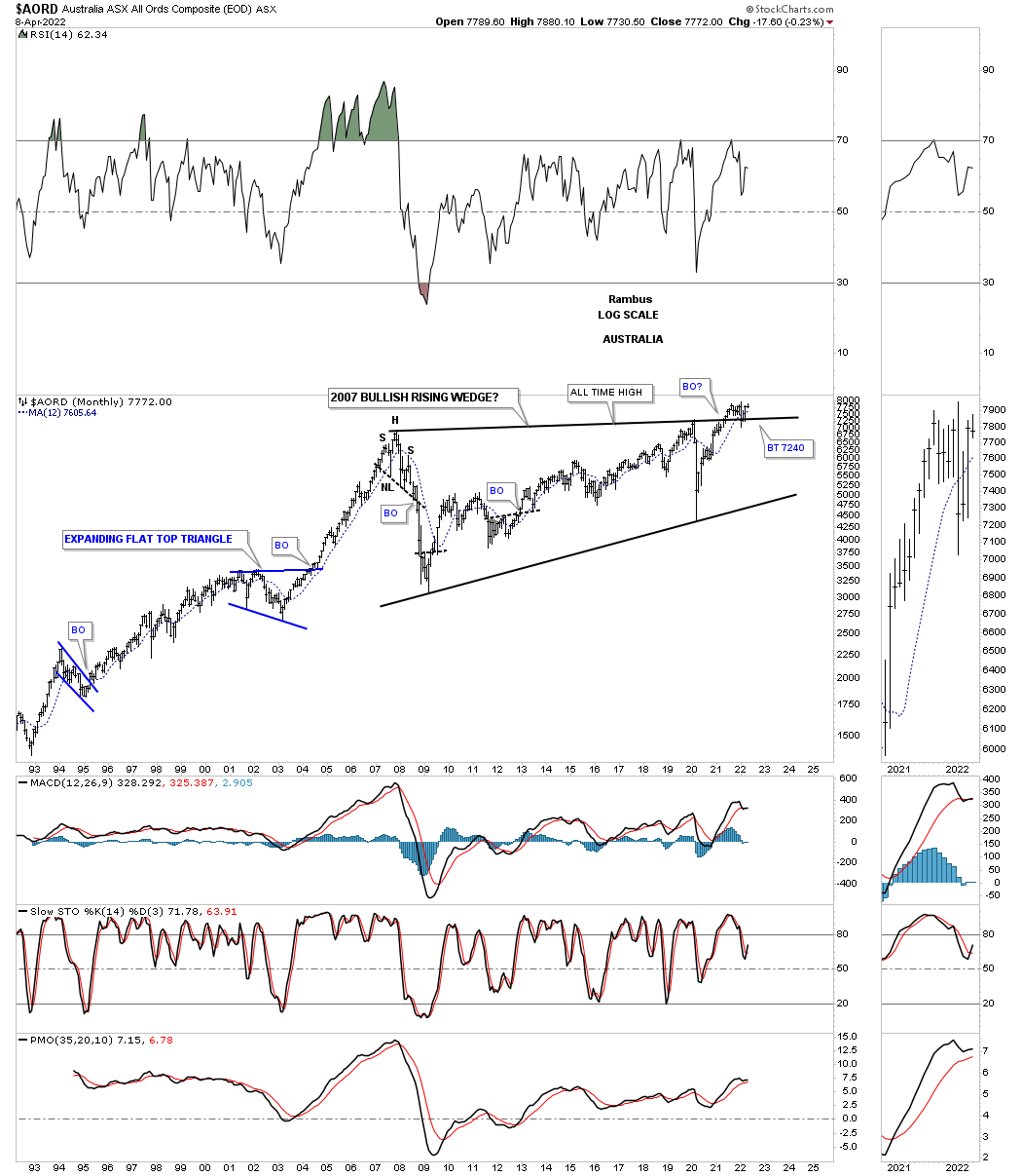
AORD, Australia stock market, which is a commodity related stock market is in the process of breaking out and backtesting the top rail of its 2007 bullish rising wedge.
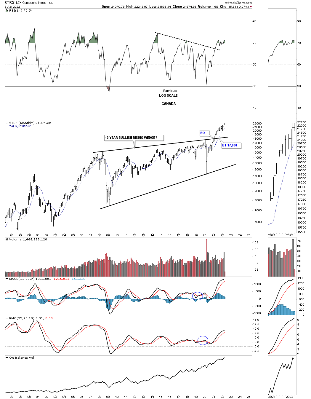
Another commodity related stock market is the, Canadian TSX, which has also broken out from its 2007 expanding triangle and is a bit further along than the AORD.
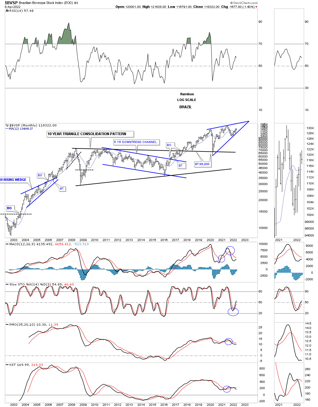
The BVSP, Brazilian stock index, could be forming a bullish rising wedge as the backtest to the 10 year triangle consolidation pattern.
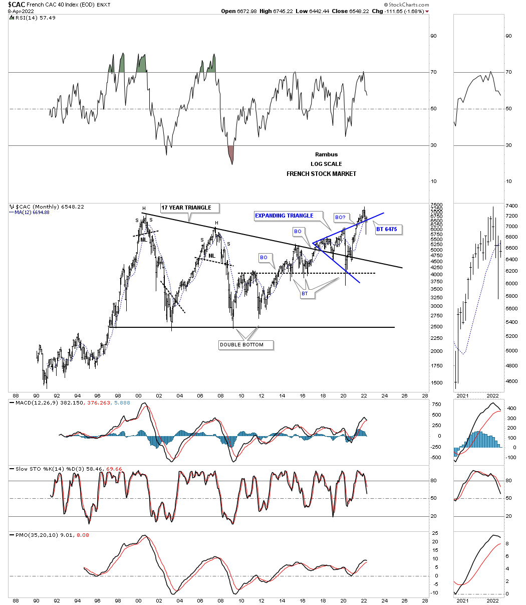
The CAC, French stock market, had a bad March and has since gained back most of its losses, but is still trading below the top rail of its expanding triangle and the 12 month sma.
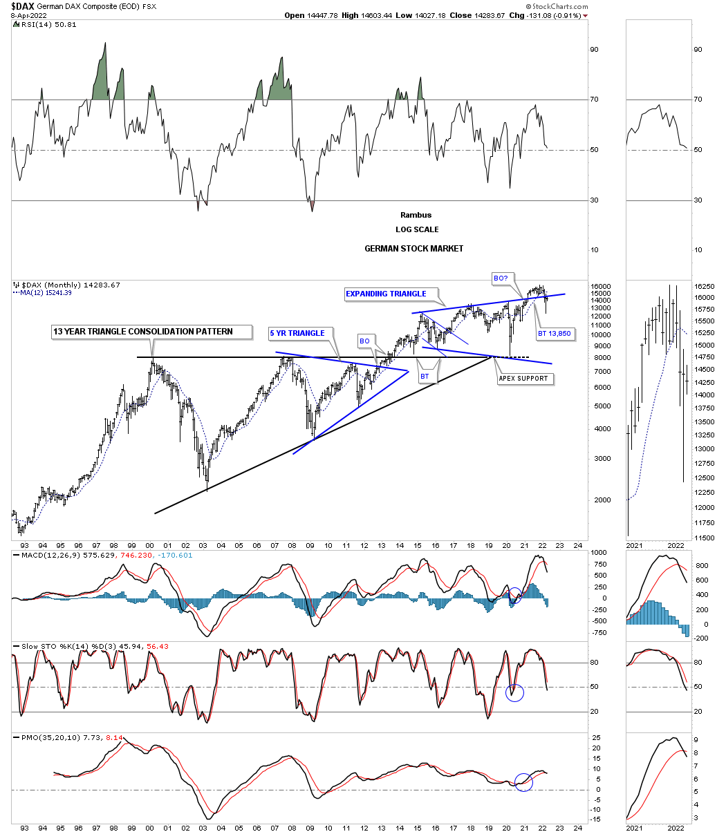
The same setup with the DAX, German stock market.
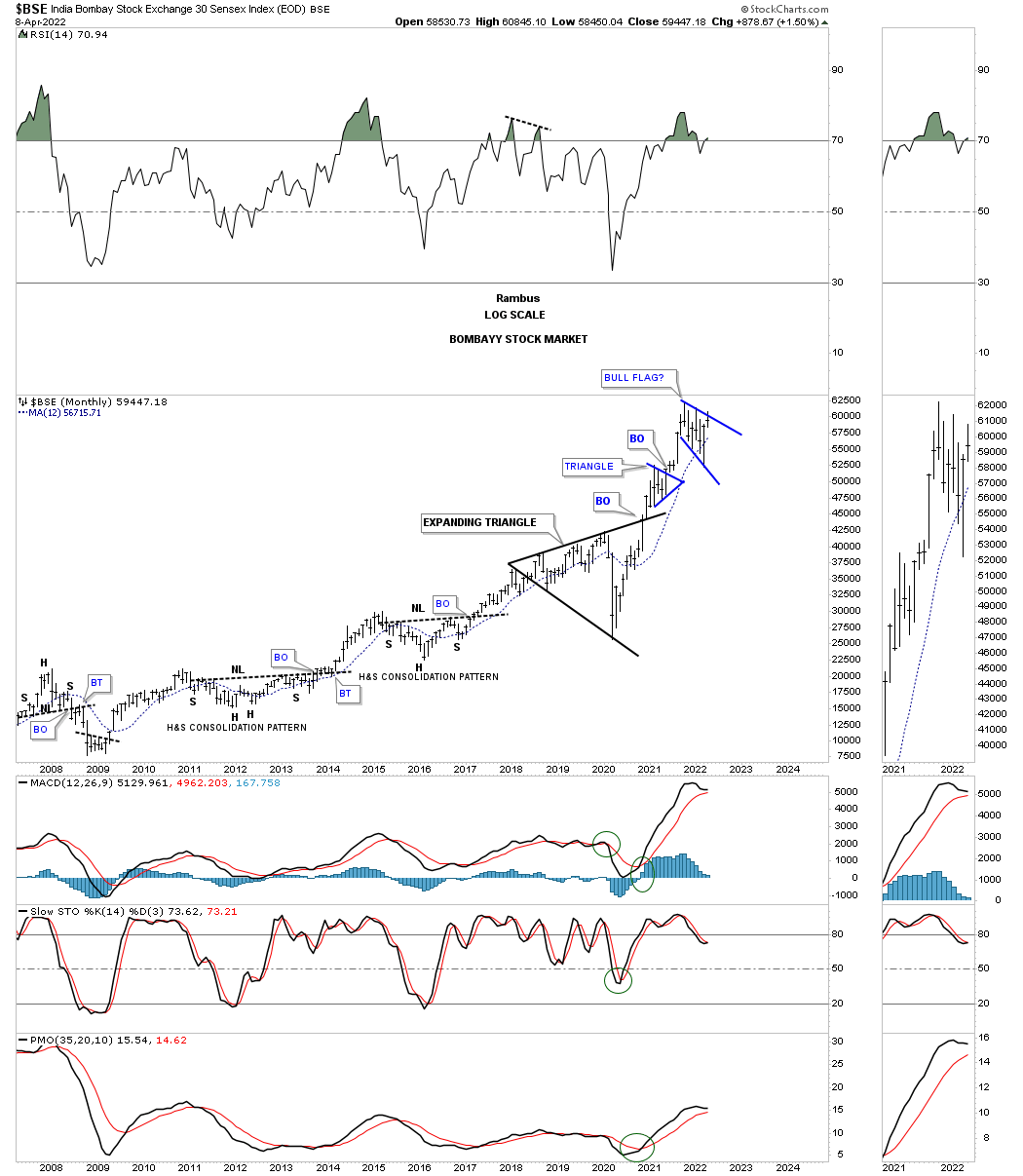
The BSE, India Bombay stock market, is one of the better looking world stock markets especially if it can breakout above the top rail of its bullish expanding falling wedge.
Lets turn our attention to some of the Asians stock markets to see how they are doing from the long term perspective.
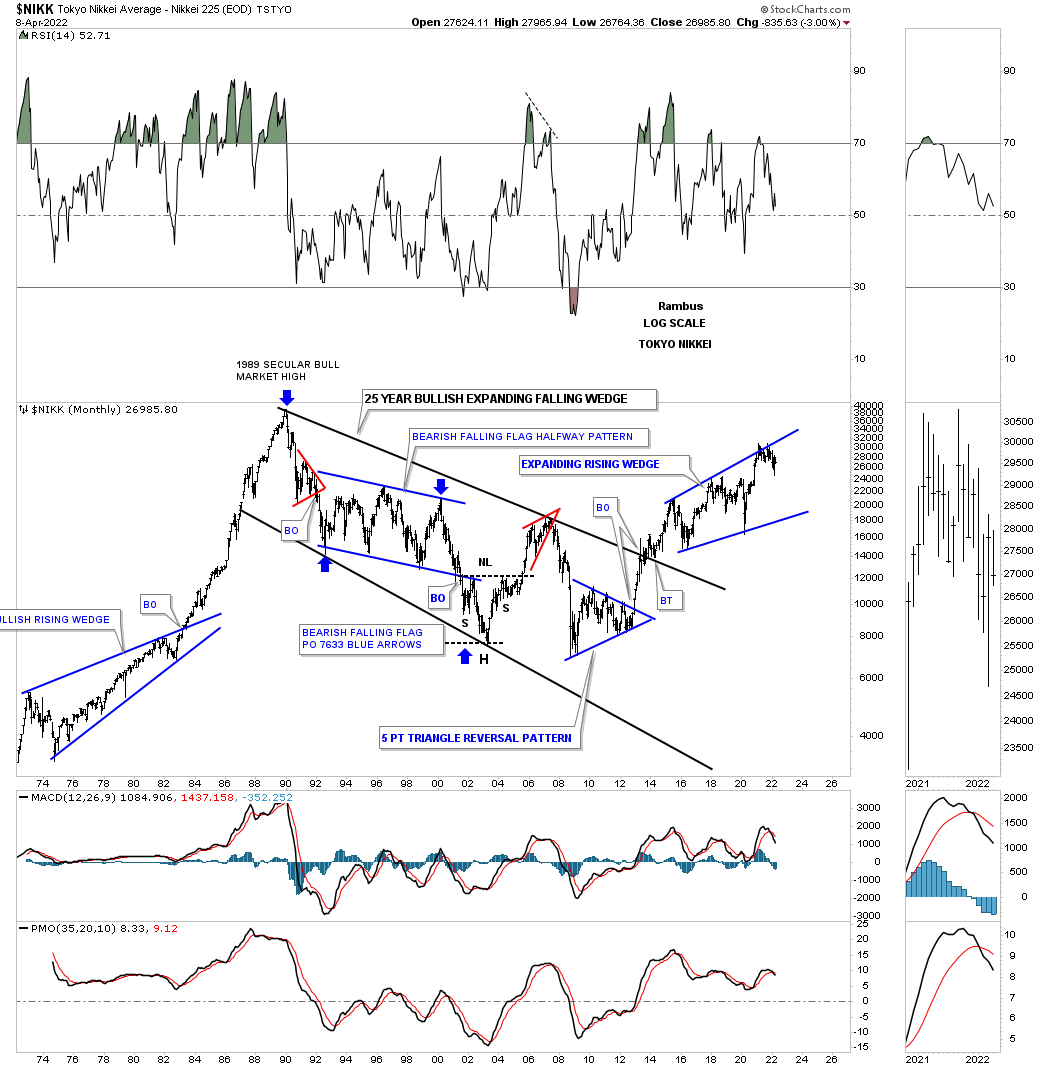
The NIKK’s, Japanese stock market, secular bull market ended with the parabolic move into its 1989 all time high after breaking out from its multi year bullish rising wedge in 1982. The parabolic rise shows you what can happen when the price action fails to create any meaningful consolidation patterns along the way up.
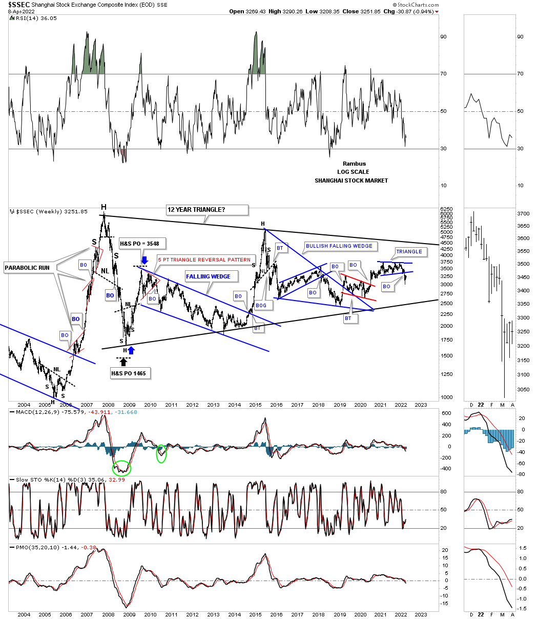
I still remember the SSEC, Shanghai stock market, when it went on its parabolic run into its 2007 all time high forming just three small red consolation patterns. You can also see the reverse symmetry on the way down vs how it went up. If you look close there was a H&S top that formed at the parabolic high which measured out pretty close.
Since that parabolic run the SSEC has been chopping sideways for the last 15 years going nowhere fast. About four weeks ago the price action broke down from the blue triangle reversal pattern which strongly suggests a move down to the bottom trendline of the 2007 triangle at a minimum.
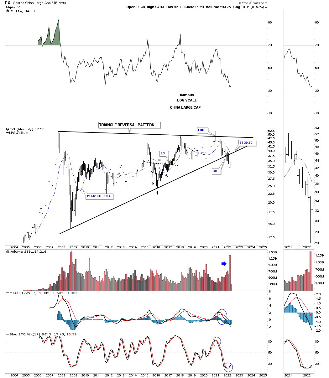
The FXI, China large cap etf, looks to be in big trouble after breaking down from the 2007 triangle reversal pattern on heavy volume.
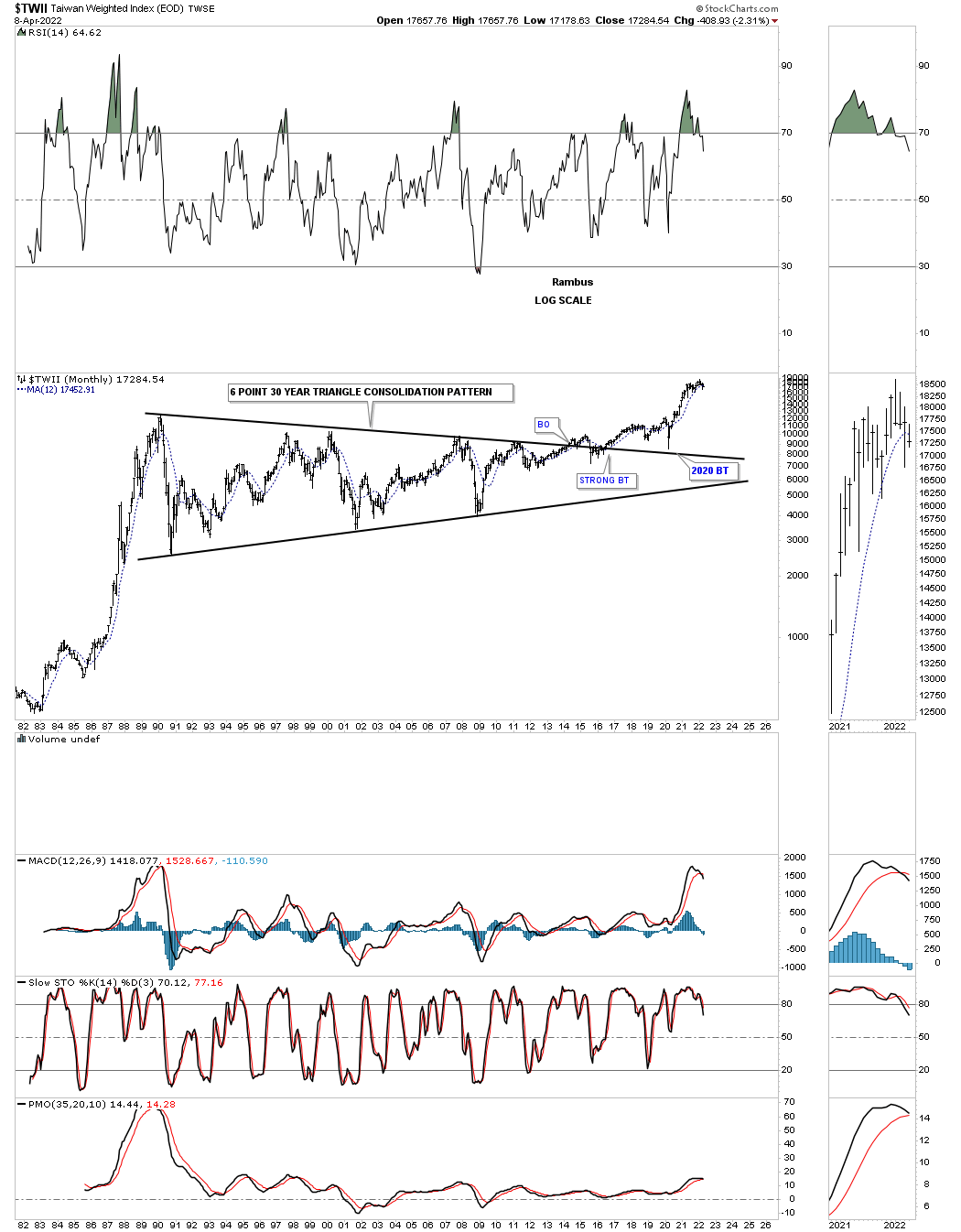
The TWII, Taiwan stock market, is the longest consolidation pattern, time wise, that I have ever had the privilege to build which finally came to fruition.
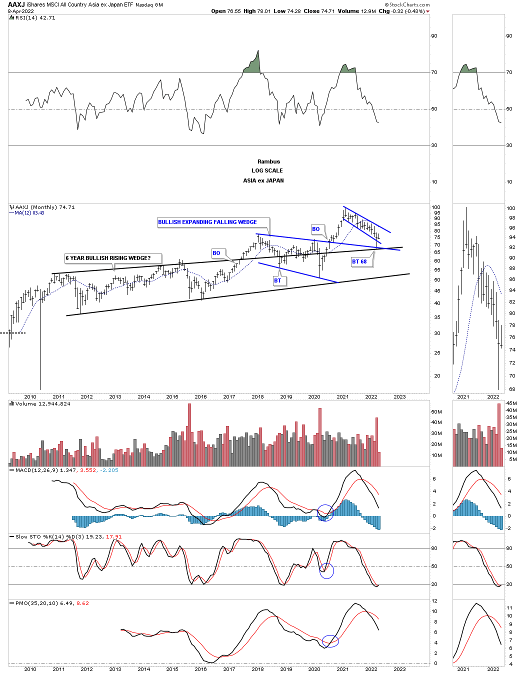
Below is the AAXJ, all Asian stock markets ex Japan, which found support recently on the top rail of its bullish rising wedge and the top rail of the expanding falling wedge.
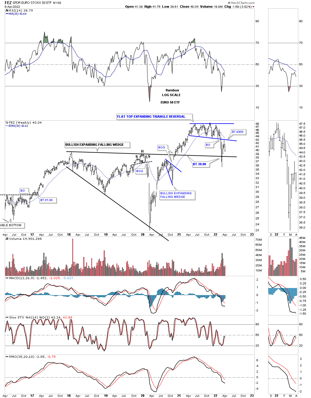
The FEZ, EURO STOXX 50, looks to be very weak after breaking down from the blue flat top expanding triangle reversal pattern. It found initial support on top of the 2018 bullish expanding falling wedge which led to the backtest. After the backtest was complete it is now in a ping pong move between both patterns.
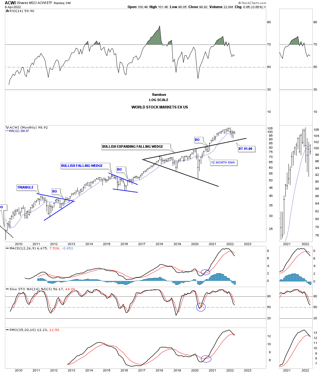
The ACWI, All world ex the US stock market, is still trading above its 2018 expanding triangle.
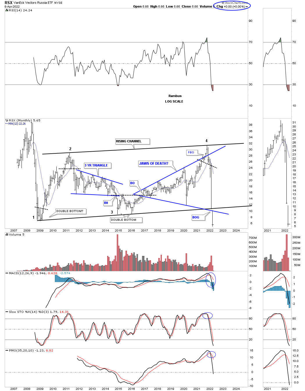
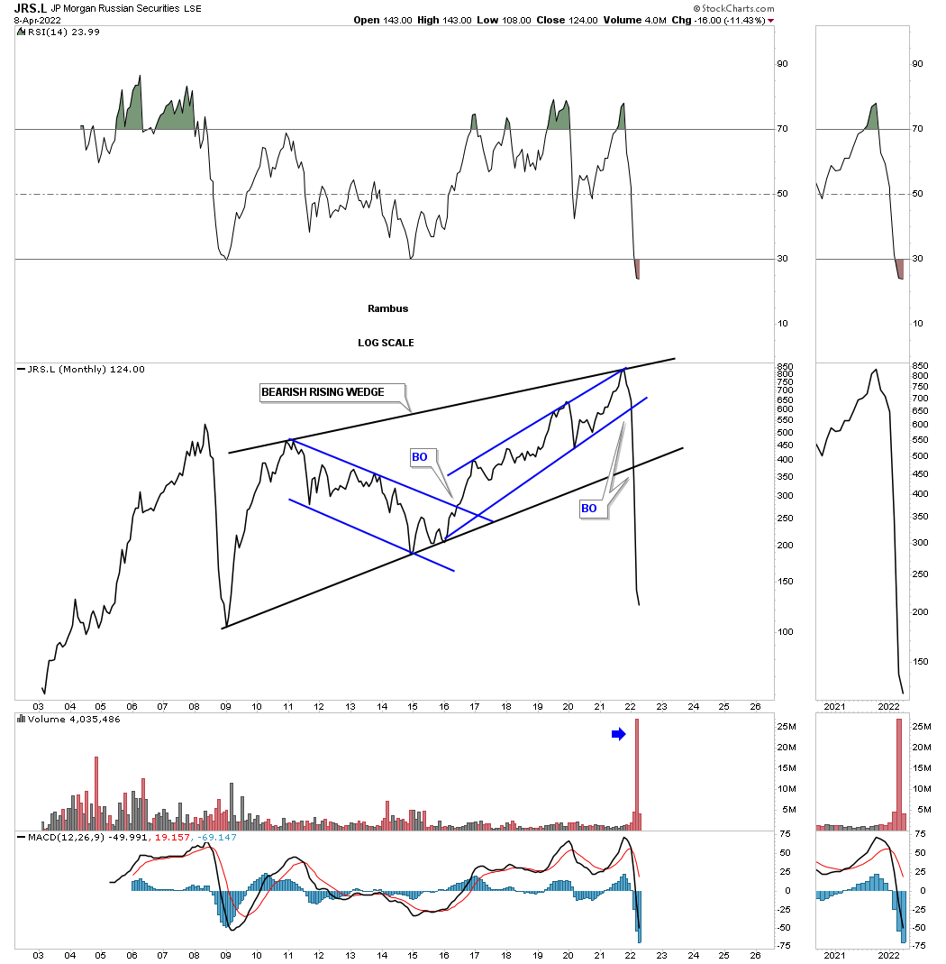
RSX, Russia etf, still shows no life since the breakout gap below the bottom rail of the 2009 rising channel and the bottom rail of the blue expanding triangle.
This long term chart shows a little more history.
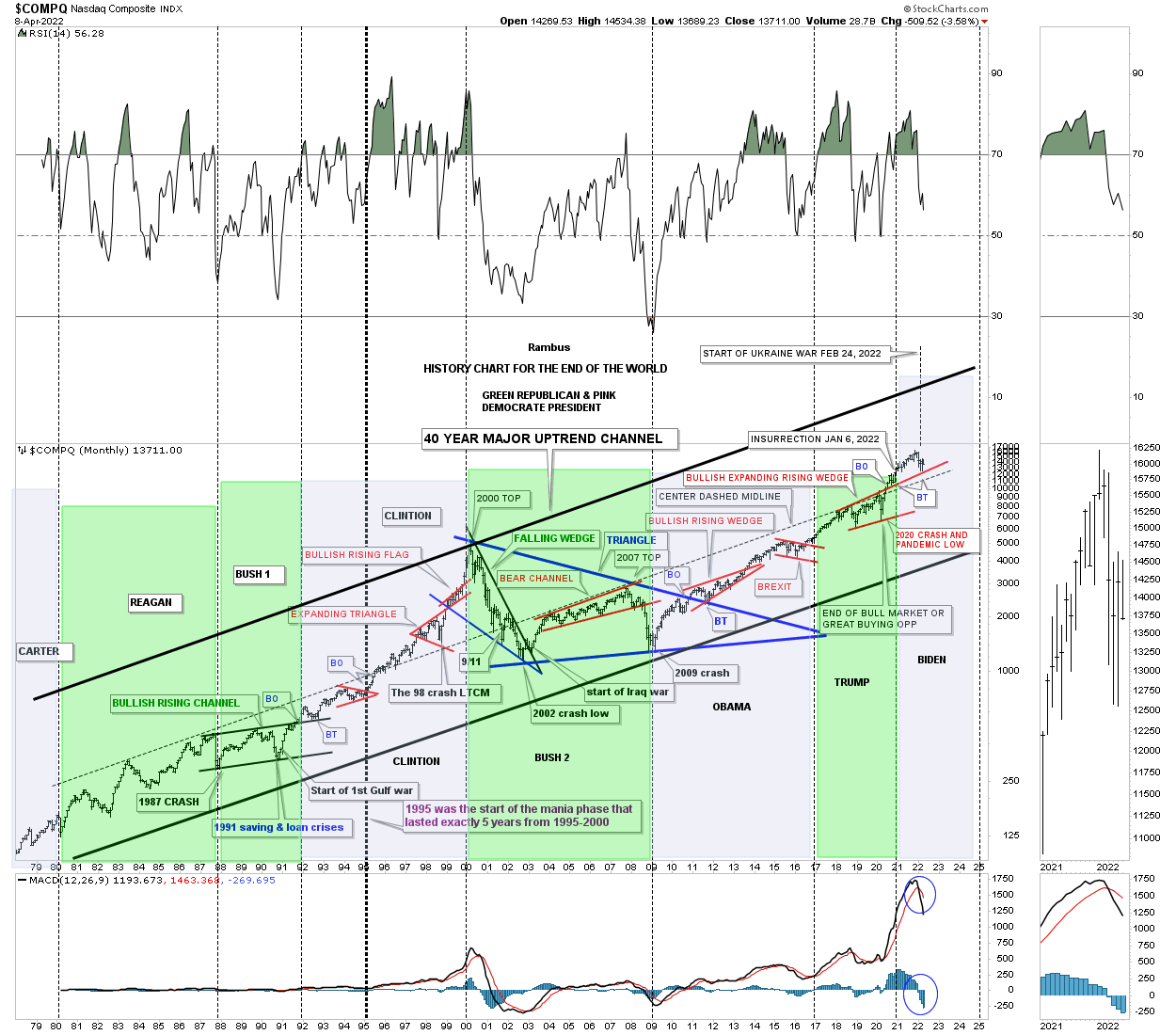
This last chart for the Quarterly Report, is the, History Chart For the End of the World, which is a satirical look at all the lows which felt like the end of the world if you were trading in real time when they occurred on the COMPQ. I updated this chart at the 2020 crash low and asked the question, “is this the end of the bull market or a great buying opportunity?” So far it has been a great buying opportunity. I just recently updated this chart again showing the start of the Ukrainian war as the backtest to the top rail of the red expanding rising wedge.
Also the green shaded areas show what the stock market did under a republican president and the pink shaded areas show what happened during a Democratic president. I also made this prediction on the day of the 2020 election. I said, it wouldn’t make any difference who was elected president and that the stock market would be higher a year from November 3rd, 2020 which was proven correct.
What will these charts look like at the end of the 2nd quarter of 2022? Stay tuned. All the best…Rambus
The Many Faces Of Gold
Before we look at the Gold charts tonight there are a couple of things I would like to explain to our new members. Long term members have heard what I’m going to explain many times in the past when we start a new impulse move. It sounds pretty basic but very important to understand.
First, you have to know what type of trader you are. There are three timeframes you need to be aware of. If you are a short term trader then you need to focus on the short term minute and daily charts for your buy and sell signals. For me personally I’m an intermediate term trader that looks for the big impulse moves between a consolidation pattern or a reversal pattern, that is why I focus more on the longer term weekly and monthly charts. If one is a long term trader then you don’t care about anything else but the big picture and longer term charts. The most important thing for a long term investor is to know with a high degree of confidence if the stock you are investing in is in a bull or bear market.
The other point I would like to make if one is an intermediate term trader is to know as soon as possible when an impulse move begins and ends. Once you have identified an important intermediate term impulse move has begun there is only one thing you need to do which is psychologically hard for most traders. What that simple and psychologically hard thing to do is, NOTHING.
What happens to most traders during an impulse move is first, they don’t understand what an impulse move actually is and try to trade the small consolidation patterns that help buildout the impulse move. If one is a short term trader that is a different story as we are talking an intermediate term move. Yes, they may capture some small profits from time to time but what happens most of the time is that they will get left behind always looking for a way to get their positions back as the stock runs higher.
There is an old Wall Street adage that I completely disagree with. It says, you can’t go broke taking a profit. That is partly true if you take a profit on every trade you make but every trade you take won’t be profitable. In a strong impulse move you can take a small profit but then you have to get back in at some point which I can tell you from first hand experience is a very hard thing to do when the trend is very strong. What usually happens is that you will pay up to get your shares back and lose the difference between where you sold and where you got back in at, rinse and repeat.
The time to trade is during the formation of a consolidation pattern and try to catch the reversal points that make up the internal structure of say, a triangle. An impulse move is an entirely different game altogether.
Everyone has to figure out what type of trader they are and to understand how the market moves. Knowing that can help you make more money than you lose. It sounds simple enough but hard to do in real time.
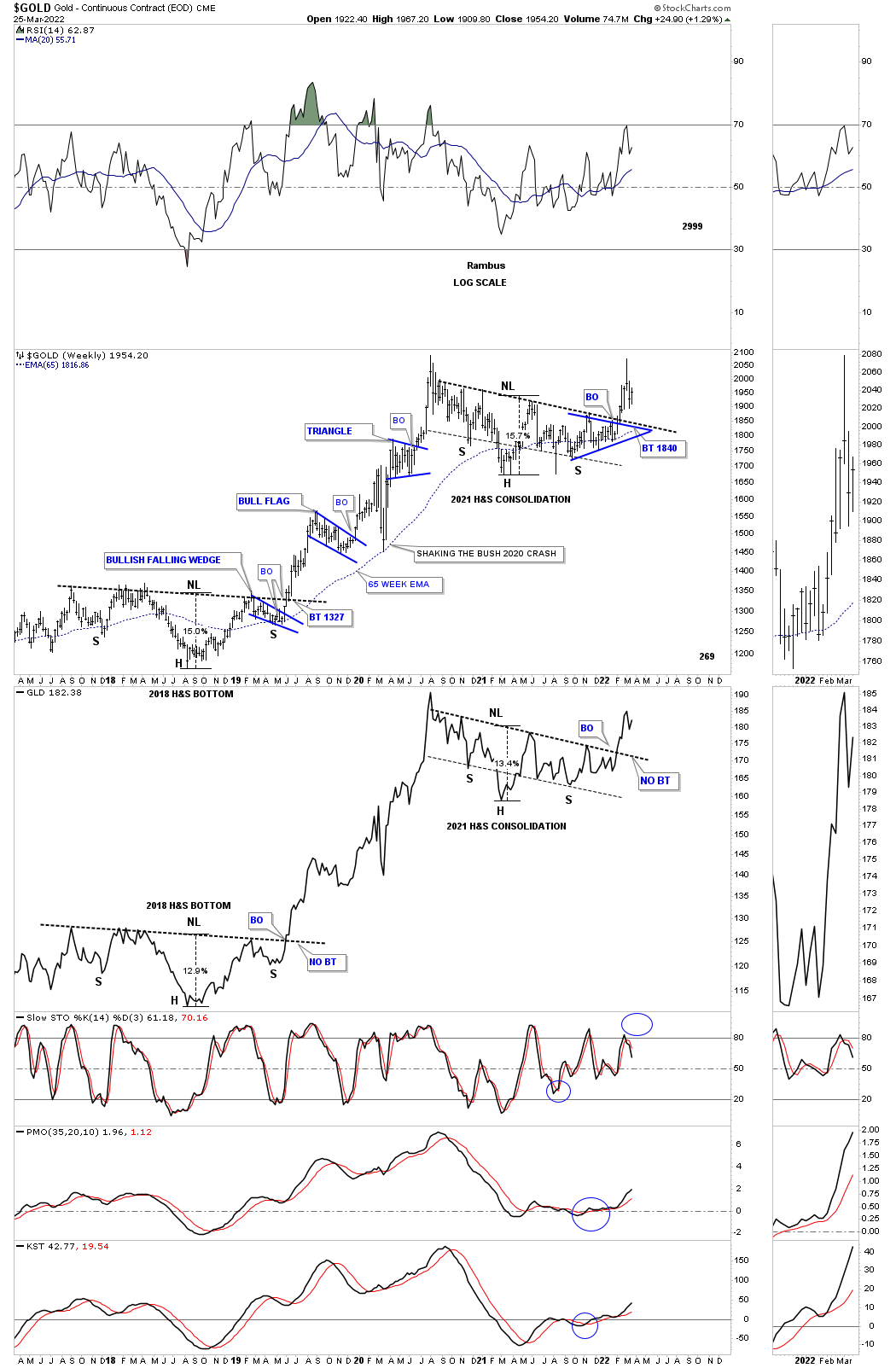
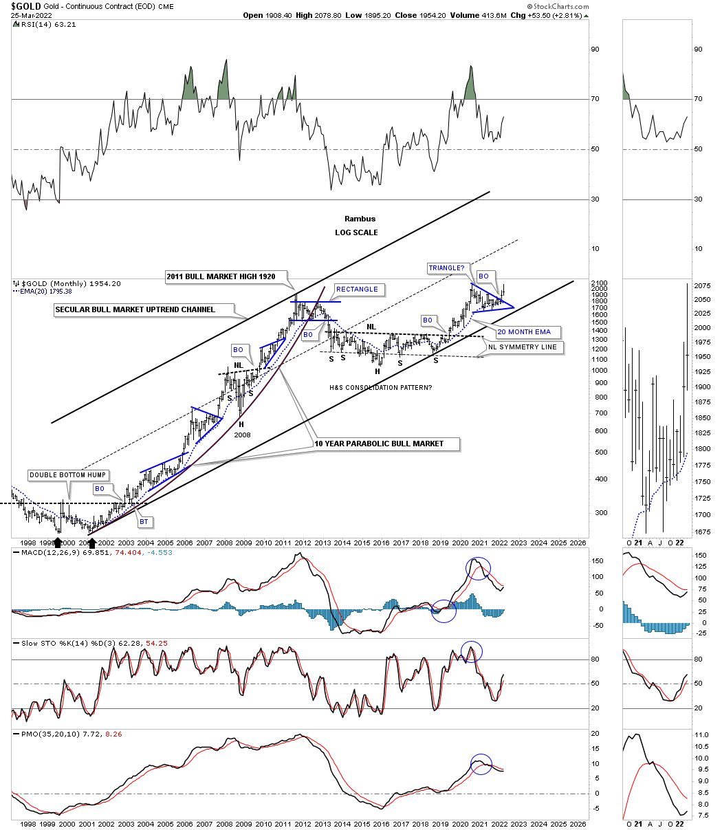
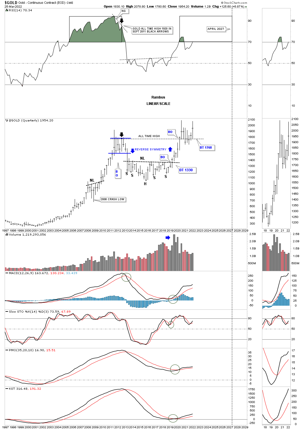
Tonight I would like to show you the many different faces of Gold from the intermediate to the longer term timeframes. We already know that big consolidation patterns are usually made up with small patterns especially in regards to H&S patterns. This first chart is a combo chart for Gold with the top chart being a bar chart and the bottom one being a line chart.
The two dominate chart patterns are the 2018 H&S bottom and the 2021 H&S consolidation pattern. Both of the patterns are almost identical in price and time as shown by the percentage move from the head to the neckline. Time wise the current H&S consolidation pattern broke out above its neckline several weeks earlier than the 2018 H&S bottom. As you can see the 2018 H&S bottom had just a one week backtest before the impulse move really took off in earnest. The current H&S consolidation pattern hasn’t experienced a backtest yet which is still possible. The main takeaway is that the impulse move has already begun regardless if we get a backtest or not.
Lets focus on the impulse move between the two H&S patterns that lasted almost two years. Looking at the nearly two year impulse move looks pretty easy in hindsight but I can assure you it is an entirely different game in real life. Put yourself in at any point from the lower H&S bottom to the 2020 high where the impulse move ended. How would you have reacted during those small consolation patterns especially the 2020 pandemic crash low?
What we do know from a Chartology perspective is that first, there was a pretty big H&S bottom which strongly suggested a big move to follow. The first minor impulse move formed the blue bull flag which confirmed the bigger impulse move was underway. The 2020 crash is not typical in a strong impulse move but Gold did find support on the 65 week ema which led to the next small impulse move up. After a couple of months of sideways chopping action formed the last consolation pattern in the big impulse move which was the blue triangle. Normally during a big impulse move you will generally see anywhere from two to four smaller consolidation patterns form.
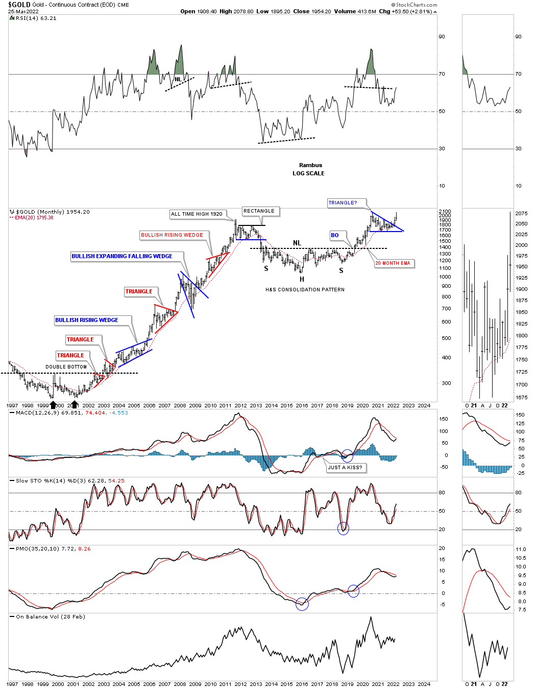
This next chart shows all the consolidation patterns that formed the bull market from the 2000 low to the 2011 high. Again, put yourself anywhere in that ten year bull market rally and how would you have reacted at any point in that bull market? This chart clearly shows you the best time to have been in Gold was during the impulse move between each consolidation pattern. If one is an investor then all you needed to know is that gold was in a bull market and to sit tight during the consolidation phases which could last up to a year. An investor would have done very well if they had spotted the top in September of 2011 and gotten out during the rectangle consolation pattern to the downside.
I have shown you many charts for the US stock markets which show the secular bull markets from 1974 to the 2000 top and the current secular bull market that began at the 2009 crash low. The beginning of the 1974 secular bull market lasted nearly 25 years with the current secular bull market currently at 13 years and counting.
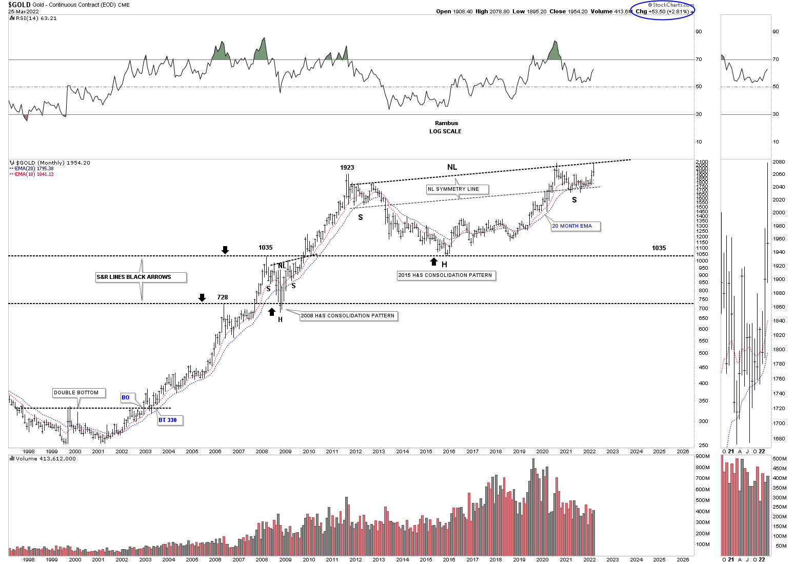
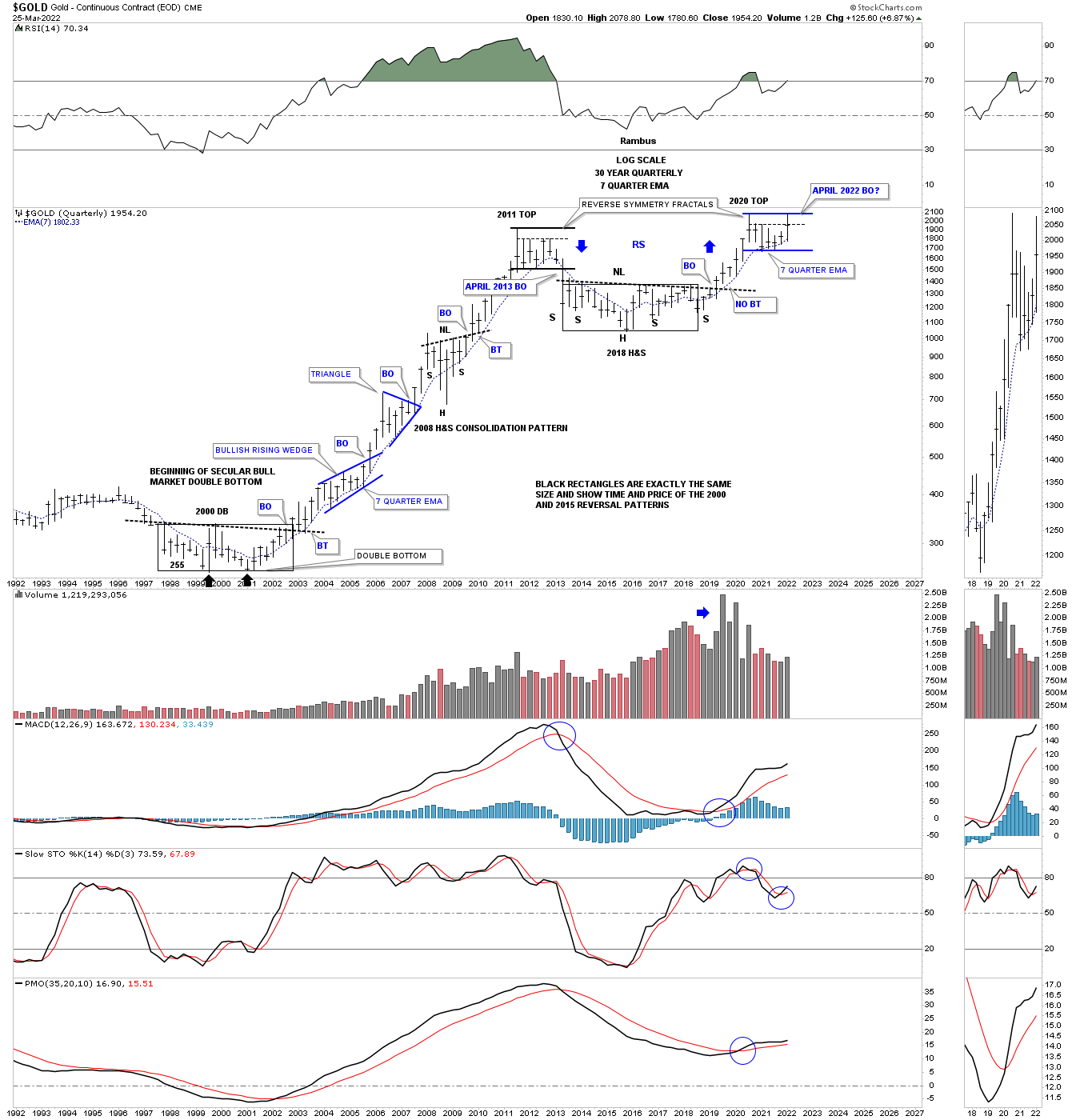
Below is Gold’s secular bull market that began in 2000 and is now 22 years old. Time wise if we added the first leg of the bull market that took eleven years to complete and added eleven years to the 2016 low, head portion of the H&S consolidation pattern, that could put the time component out to the 2026 area using the H&S as a halfway pattern.
There is no way to know 100% for sure when the time component will be completed but for now it is a good guide we can use. There will be other things we will be following that will help us in signaling the end of the secular bull market but at this point we should have at least four more years at a minimum ahead of us.
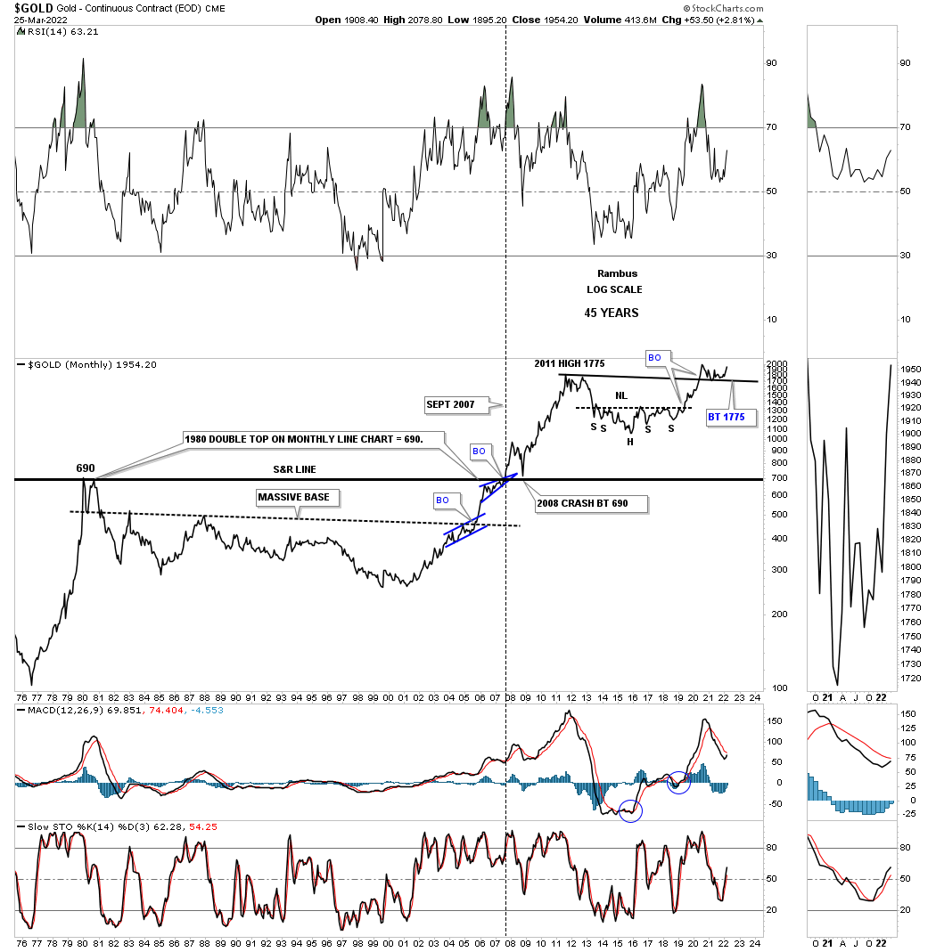
The first quarter of 2022 will end in just four more days of trading for the month of March. Gold is currently trading at the highest level since the 2020 high with the 2011 high holding support, previous resistance turning into support once tested from above. You can see something similar during the breakout of the support and resistance line in 2007, resistance turning into support when broken to the upside.
This face for Gold shows its massive H&S consolidation pattern which I’m viewing as a halfway pattern in the secular bull market that began at the 2000 low. You can measure the distance between the head and the neckline to get a minimum price objective for Gold which again is a minimum.
This next chart is a long term quarterly bar chart which is beginning to look very bullish. By that I mean look at the current quarterly bar and how the price action has held support on the backtest to the 2011 high. From my perspective all the work has been done with the backtesting process and now it is time for the real impulse move to take hold which by the end of the next quarter I expect to see the next quarterly bar much higher than the first quarterly bar for 2022. We won’t know for sure until the 2nd quarter is finished but the setup looks extremely bullish especially if we see a new all time high being made in the next three months.
This next chart for Gold is the quarterly fractal chart we’ve been following for over a year or so which compares the 2000 trading range to the current 2020 trading range. Previously I mentioned that the month of March of 2022 we should see Gold trading at the top of the trading range which has happened. Now count the number of quarterly bars in the 2011 trading range and the 2020 trading range which is seven. The eighth quarterly bar made during the 2011 trading range broke through the bottom rail which confirmed the bear market. On April first of this year Gold will be starting to form its eighth quarterly bar which I believe will show a breakout to the upside inversely to the 2011 fractal.
What this chart also reveals to us is how similar the 2000 double bottom base and the 2016 H&S base are in both time and price as shown by the black rectangles. After the breakout from the double bottom base in 2000 the first consolidation pattern to have formed was the bullish rising wedge. If you count the number of quarterly bars in that bullish rising wedge you will count seven which is the same number as our current trading range. So if the blue bullish rising wedge was the first consolation pattern in the 2000 bull market is our current trading range the first consolidation pattern in the 2016 second leg up of the secular bull market?
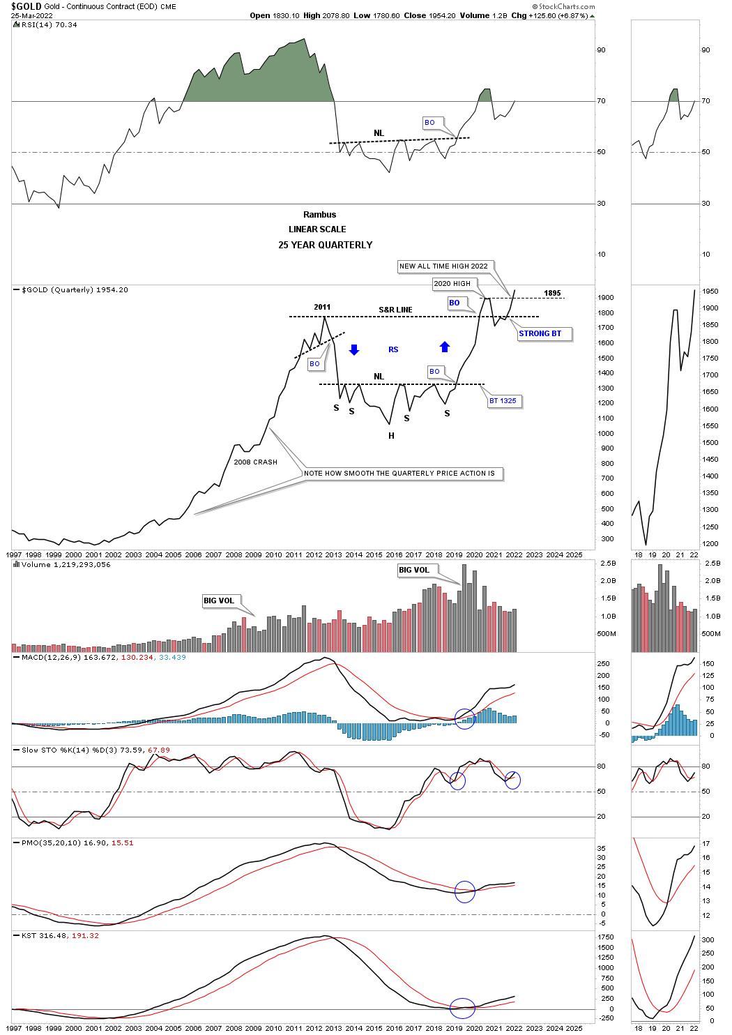
Below is a quarterly line chart which really puts things in perspective for me. Again, in just four more days of trading Gold will begin its next quarterly bar of trading. On a quarterly closing price Gold is trading at a new all time high. Remember a line chart will often show you a breakout before a bar chart does.
Another important aspect of this quarterly line chart is that it shows you how smooth the price action was during the bull market years from 2000 to 2011. The only real hook lower was the 2008 crash low and when the 2011 top was completed. Other than that Gold made a new higher high except for a few minor blips by the end of each quarter. Note the price action starting at the right shoulder low and how smooth it looks except for the backtest to the 2011 high.
If the Chartology plays out as expected the 2nd quarter of 2022 should be something to behold for the PM complex and for those that can ride the bull and not get bucked off. We could very well be in for the ride of a lifetime. All the best…Rambus
Editors Note
Can you afford to navigate this Gold bull without Rambus ?
Subscribe here
Related Reading:
- Rambus: Blockbuster Chartology – February, 2022
- Rambus: Blockbuster Chartology – October, 2021
- Rambus: Blockbuster Chartology – July, 2021
- Rambus: Blockbuster Chartology – April, 2021
- Rambus: Blockbuster Chartology – January, 2021
- Rambus: Blockbuster Chartology – October, 2020
- Rambus: Blockbuster Chartology – July, 2020
- Rambus: Blockbuster Chartology – May, 2020
- Rambus: Blockbuster Chartology – January, 2020
- Rambus: Blockbuster Chartology – October, 2019
- Rambus: Blockbuster Chartology – July, 2019
- Rambus: Blockbuster Chartology – April, 2019
- Rambus: Blockbuster Chartology – January, 2019
- Rambus: Blockbuster Chartology – October, 2018
- Rambus: Blockbuster Chartology – July, 2018
- Rambus: Blockbuster Chartology – April, 2018
- 2017 Annual Wrap Up – Does Your Pension Fund Have A Deep State Drain? – January, 2018
- 1st Quarter Wrap Up 2018 Web Presentation
- Blockbuster Chartology with Rambus – October, 2017
- Blockbuster Chartology with Rambus – July, 2017
- Blockbuster Chartology with Rambus – May, 2017
- Blockbuster Chartology with Rambus – January, 2017
- Blockbuster Chartology with Rambus – October 20, 2016
- Blockbuster Chartology with Rambus – July 21, 2016
- Blockbuster Chartology with Rambus – April 21, 2016
- Rambus: Are We in a Deflationary Spiral? – January 28, 2016
- The Dollar, Gold & the S&P 500 with Rambus – October 15, 2015